
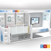
CVS Trade Show Booth
CVS Tradeshow Booth I created back in 2010
Newly added To Portfolio, CVS Trade Show Booth, Created for Sheridan College & Creative Visual Solutions. Technical Illustration. Architectural Construction. 3D.
The idea behind this project was to design a booth that was unique enough to stand out – but also one that could fit within the strict dimensions and guidelines of most trade show events whilst still being modular.
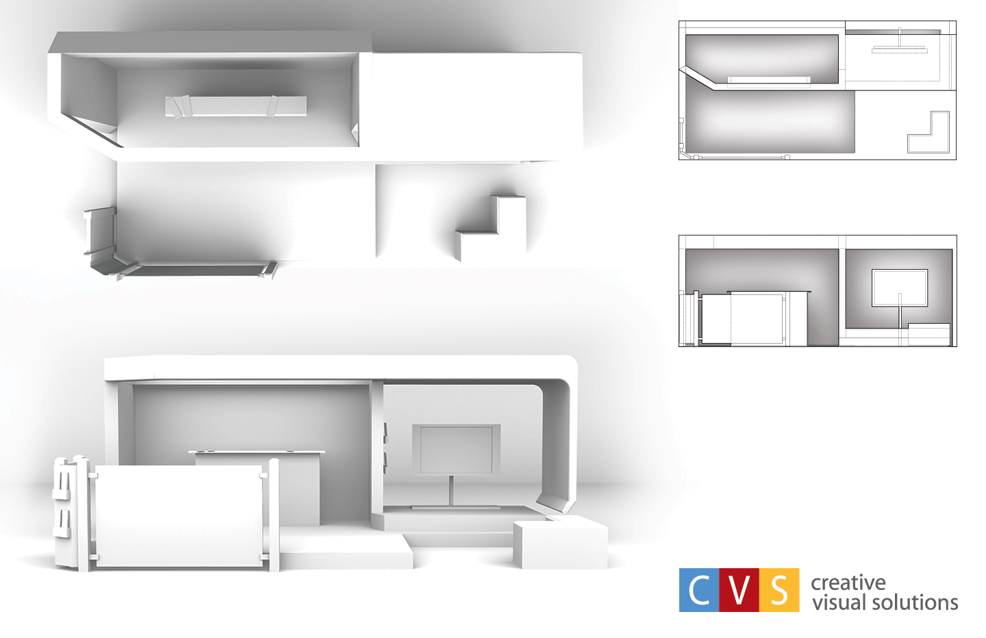
The size dimensions of the booth needed to fit within a 10x20ft space with about an 8ft ceiling, which is pretty common for most trade show spaces. In the original design, the roof stretched overtop of the monitor and floated just inches above the floor. As the concept grew, changes needed to be made. More thought was put into the construction and stability benefiting the overall design.
The size dimensions of the booth needed to fit within a 10x20ft space with about an 8ft ceiling, which is pretty common for most trade show spaces.
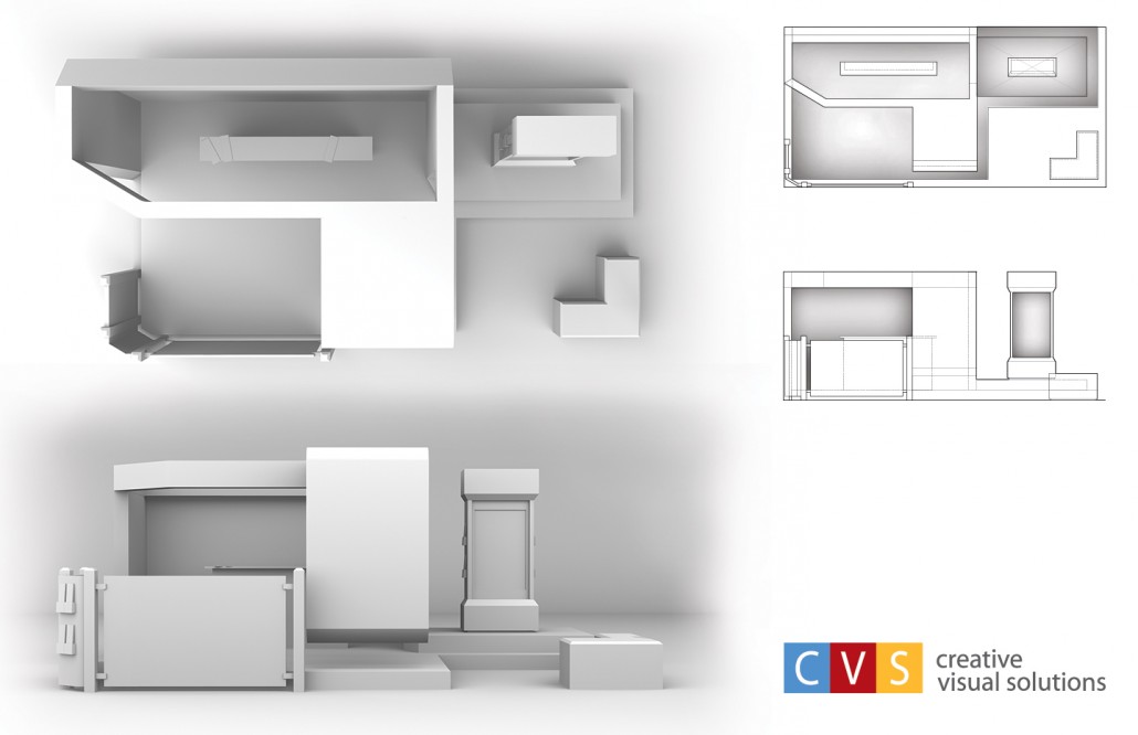 The earlier design to the left came from a side profile sketch that didn’t include the front glass barrier and brochure stand. As other elements were added the design became less organic and front heavy like it would topple over. Changes were made to make it more open and inviting to guest. In the final design the Monitor on the right was given some walls to keep sound isolated to guest seated at the small box seats which also doubled as storage bins.

Recent Comments