
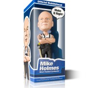
Mike Holmes Official Bobblehead Packaging
Mike Holmes Official Bobblehead Packaging, 2013
Newly added To Portfolio, Mike Holmes Official Bobblehead Packaging, Created for The Holmes Group. Product Design
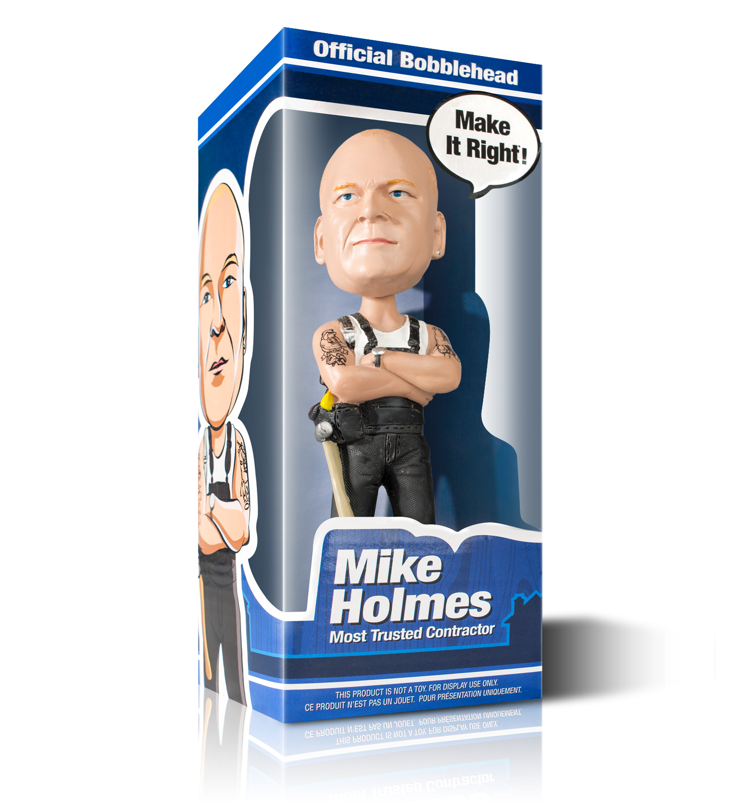
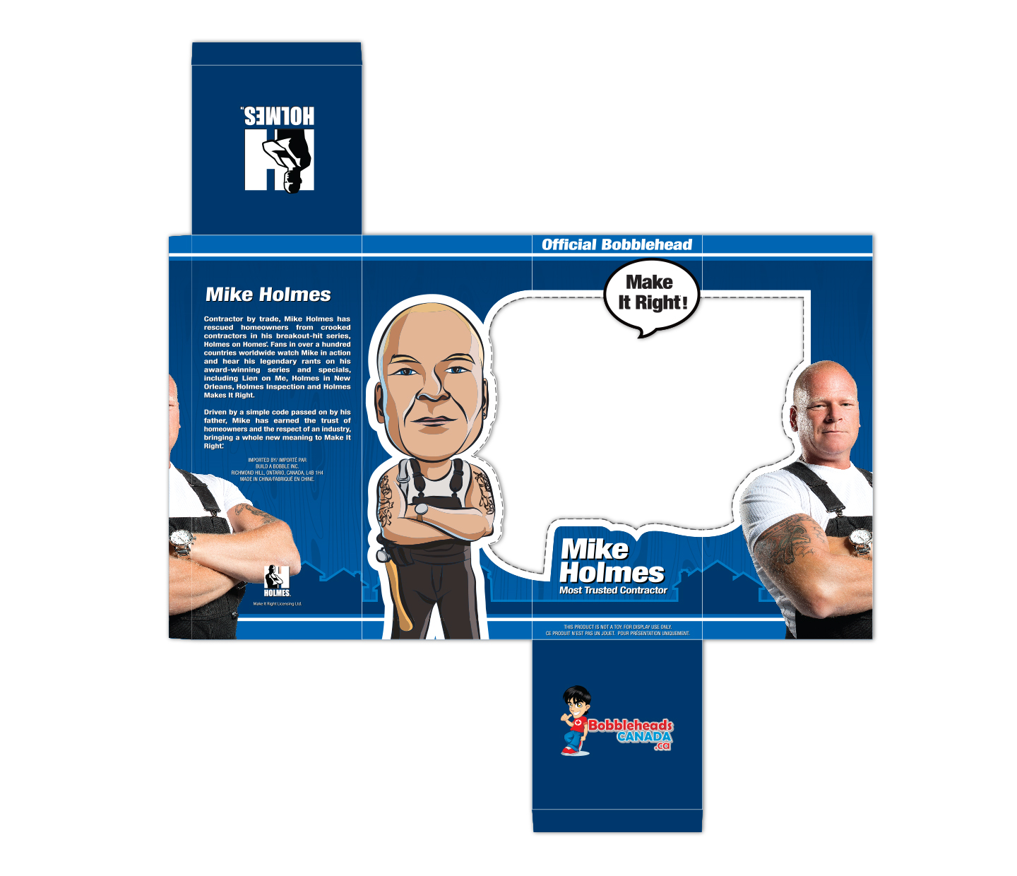
Earlier this year I was asked to come up with packaging for a brand new Mike Holmes bobblehead doll/toy. I was more than happy to have a project like this to work on. It started with the modeling of mike’s head and body that was done by www.bobbleheadscanada.ca. (He worked from two reference shots of Mike’s head, both front & side profiles to create a successful likeliness of mike’s face). Once that was completed I was given the model to take dimensions from and test out packaging ideas. I knew from the get go that I wanted to have a large visible window to showcase Mike’s bobblehead, so I tested out some designs in photoshop and then printed them out. I took the printed pieces and assembled them together to get an actual view of the box. Once I had a better understanding of that I went ahead and came up with a theme and colour that would suit the project but also the company behind it. The colour theme I chose to go with was a nice middle tone blue that I thought would match the look of the Holmes Group’s current products but still have a little more colour. The reason for this was because I wanted a more cartoony look as it would better match the fact that it was a bobblehead and not some cold tool.
Mike Holmes Official Bobblehead
“I tested out some designs in photoshop and then printed them out. I took the printed pieces and assembled them together to get an actual view of the box. Once I had a better understanding of that I went ahead and came up with a theme and colour that would suit the project but also the company behind it”.
I was also tasked to come up with the tattoos that the bobblehead has featured on both arms. They were created using reference images of Mike’s actual tattoos, dumb down a little bit as I knew there would be scaling issues with the decals. Creating the tattoos really helped make the bobblehead feel more like the real & “current” Mike Holmes so I’m happy they turned out, better than expected. I used Illustrator to create the tattoos as well as the rest of the packaging. I highly recommend any illustrators just starting out to try their hand at the slice tool as it works really great in creating cartoony imagery.
Packaging
“Creating the tattoos really helped make the bobblehead feel more like the real & “current” Mike Holmes so I’m happy they turned out, better than expected”.
More images for this project can be found in my portfolio under, Mike Holmes Official Bobblehead Packaging
Recent Comments