
The Holmes Manual
The Holmes Manual, 2014
Copyright © 2014 Restovate Ltd. All rights reserved. Created for The Holmes Group & Harper Collins
I have a couple illustrations featured in Mike’s all-new book, The Holmes Manual. Due for release June 3rd, 2014. Please check it out!

The Holmes Manual Cover
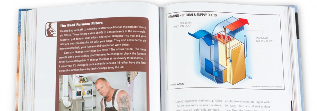
Maintaining your home now will make your life easier down the road. As Canada’s most trusted contractor, Mike Holmes helps you Make It Right. Providing solutions to everyday problems, The Holmes Manual has your whole house covered: from top to bottom, outside to inside, foundations to finishes. Mike answers the questions homeowners ask him all the time, including: Why do my windows have moisture in them? What is the life expectancy of plumbing? What kind of ceiling is best in a basement? How often should I have my ducts cleaned? How can I tell if our house has mold? Packed with handy tips, photographs, and diagrams, The Holmes Manual is a must-have guide for every homeowner.
More Projects done for The Holmes Group, can be found in the portfolio section. Portfolio
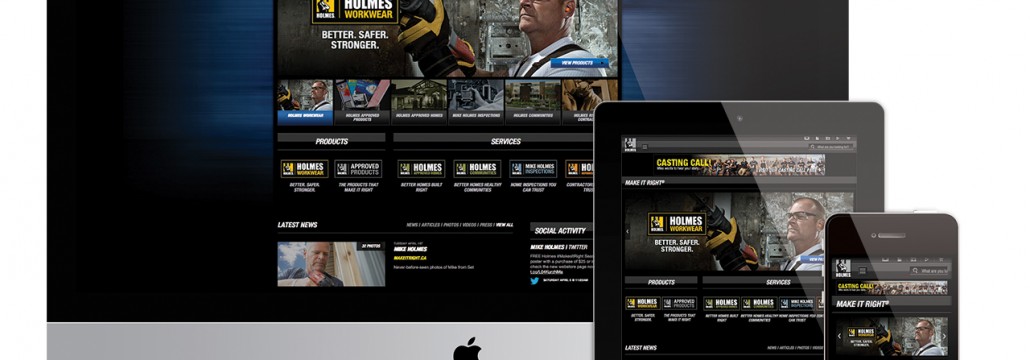
MakeitRight® Responsive Website
Makeitright.ca Responsive website, 2014
Newly added To Portfolio, MakeitRight® Responsive website, Created for The Holmes Group. Web Design
This is a project that I’ve been working on for a fairly long time and one which is still ongoing. I had the opportunity to completely overhaul the previous version of makeitright.ca. A website that was created in the days of the now defunct flash. It was a daunting task at first glance. The site is fairly large with many sections – resources, current productions, services, photos, videos, news a webstore and a non-profit foundation section. Not to mention trying to retro-fit old tv-show pages to work within the new responsive template. Working with the communications team here at the Holmes Group, we were able to categories and map out the sections accordingly, a task that took probably just as long as the design process itself.
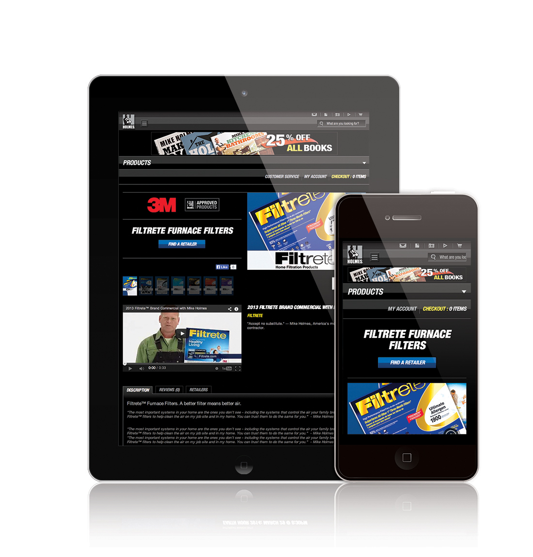
MIR Webstore
The site is fairly large with many sections – resources, current productions, services, photos, videos, news a webstore and a non-profit foundation section.
The design process started with the Webstore. A Section which exists independently of the main site Using OS Commerce. This was a good starting point for the redesign as it allowed us to narrow down the design elements needed for the new site. Everything started with the Global Navigation menus for both desktop and mobile versions. Once this was decided we began testing in-house to see how things would work and flow together.
After the webstore was completed which was about 5 months beforehand, we moved onto the homepage and main navigational pages. (We held off on the webstore launch in the meantime, due to issues regarding member login accounts and the confusion around christmas time.)

MIR Photo Gallery Comp Desktop
One of the more interesting bits in the design process was coming up with the flow of photogallery section. Photographers like photos to be displayed at their best resolution possible which is not only hard to do for web but even harder to do while creating a responsive website. I came up with the concept below to try and create that balance between print ready and web friendly quality photos. The Technical line drawing below was given to a team of developers at trademark5150 to help them better understand the flow of the photo pages. It also helped me to design the page so it would work for this format. (Form vs Function!) In MIR photo gallery comp desktop you can see the working stages vs the final stage of both the photogallery index page and the gallery itself.
The way the photo gallery pages worked on the tablet and mobile versions also had to be consider. Here you can see that process.
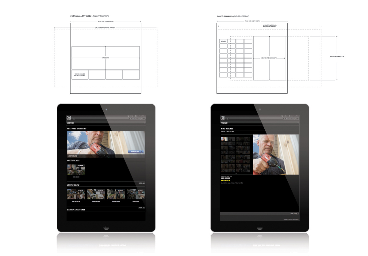
MIR Photo Gallery Comp Tablet
Photographers like photos to be displayed at their best resolution possible which is not only hard to do for web but even harder to do while creating a responsive website.

MIR Photo Gallery Comp Mobile
More images for this project can be found in my portfolio under, MakeitRight® Responsive Web Design.

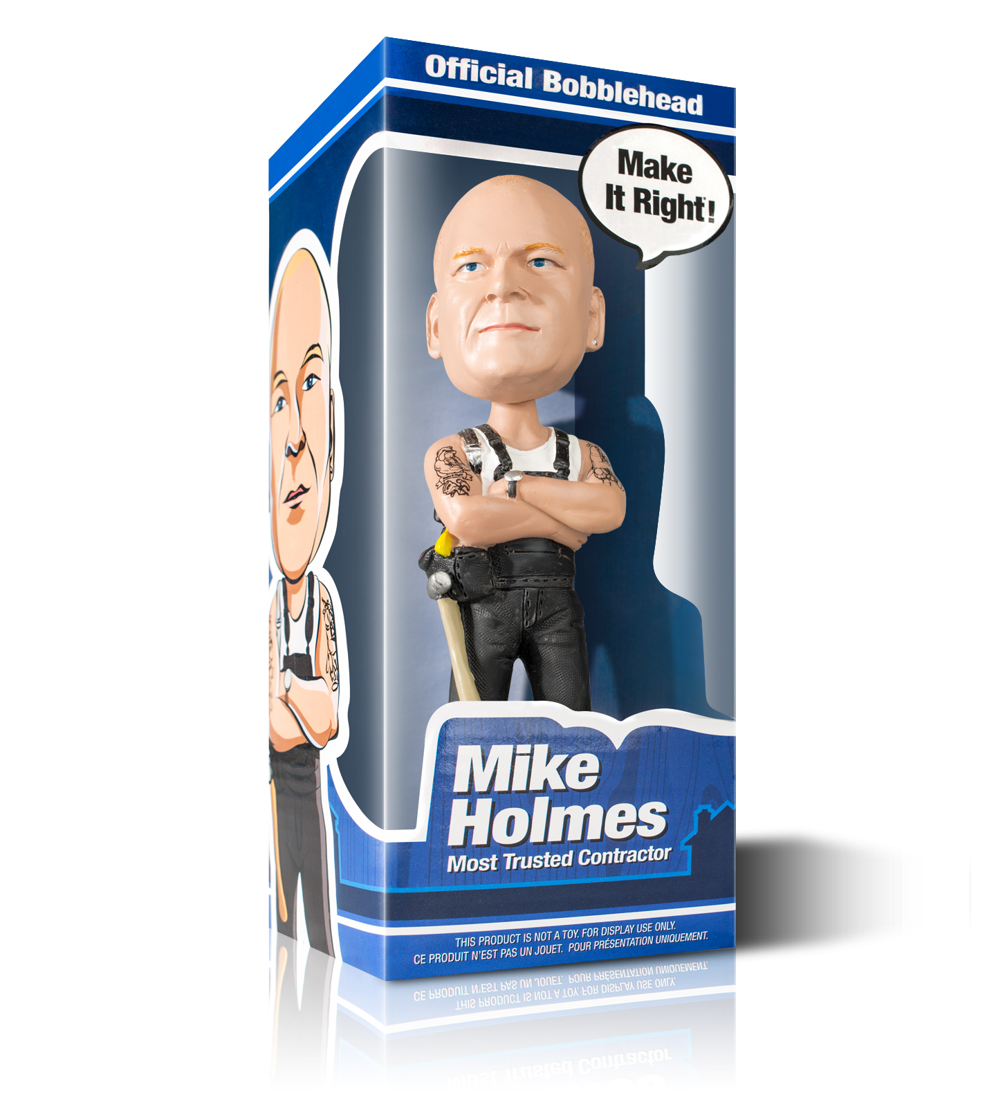
Mike Holmes Official Bobblehead Packaging
Mike Holmes Official Bobblehead Packaging, 2013
Newly added To Portfolio, Mike Holmes Official Bobblehead Packaging, Created for The Holmes Group. Product Design
Earlier this year I was asked to come up with packaging for a brand new Mike Holmes bobblehead doll/toy. I was more than happy to have a project like this to work on. It started with the modeling of mike’s head and body that was done by www.bobbleheadscanada.ca. (He worked from two reference shots of Mike’s head, both front & side profiles to create a successful likeliness of mike’s face). Once that was completed I was given the model to take dimensions from and test out packaging ideas. I knew from the get go that I wanted to have a large visible window to showcase Mike’s bobblehead, so I tested out some designs in photoshop and then printed them out. I took the printed pieces and assembled them together to get an actual view of the box. Once I had a better understanding of that I went ahead and came up with a theme and colour that would suit the project but also the company behind it. The colour theme I chose to go with was a nice middle tone blue that I thought would match the look of the Holmes Group’s current products but still have a little more colour. The reason for this was because I wanted a more cartoony look as it would better match the fact that it was a bobblehead and not some cold tool.
Mike Holmes Official Bobblehead
“I tested out some designs in photoshop and then printed them out. I took the printed pieces and assembled them together to get an actual view of the box. Once I had a better understanding of that I went ahead and came up with a theme and colour that would suit the project but also the company behind it”.
I was also tasked to come up with the tattoos that the bobblehead has featured on both arms. They were created using reference images of Mike’s actual tattoos, dumb down a little bit as I knew there would be scaling issues with the decals. Creating the tattoos really helped make the bobblehead feel more like the real & “current” Mike Holmes so I’m happy they turned out, better than expected. I used Illustrator to create the tattoos as well as the rest of the packaging. I highly recommend any illustrators just starting out to try their hand at the slice tool as it works really great in creating cartoony imagery.
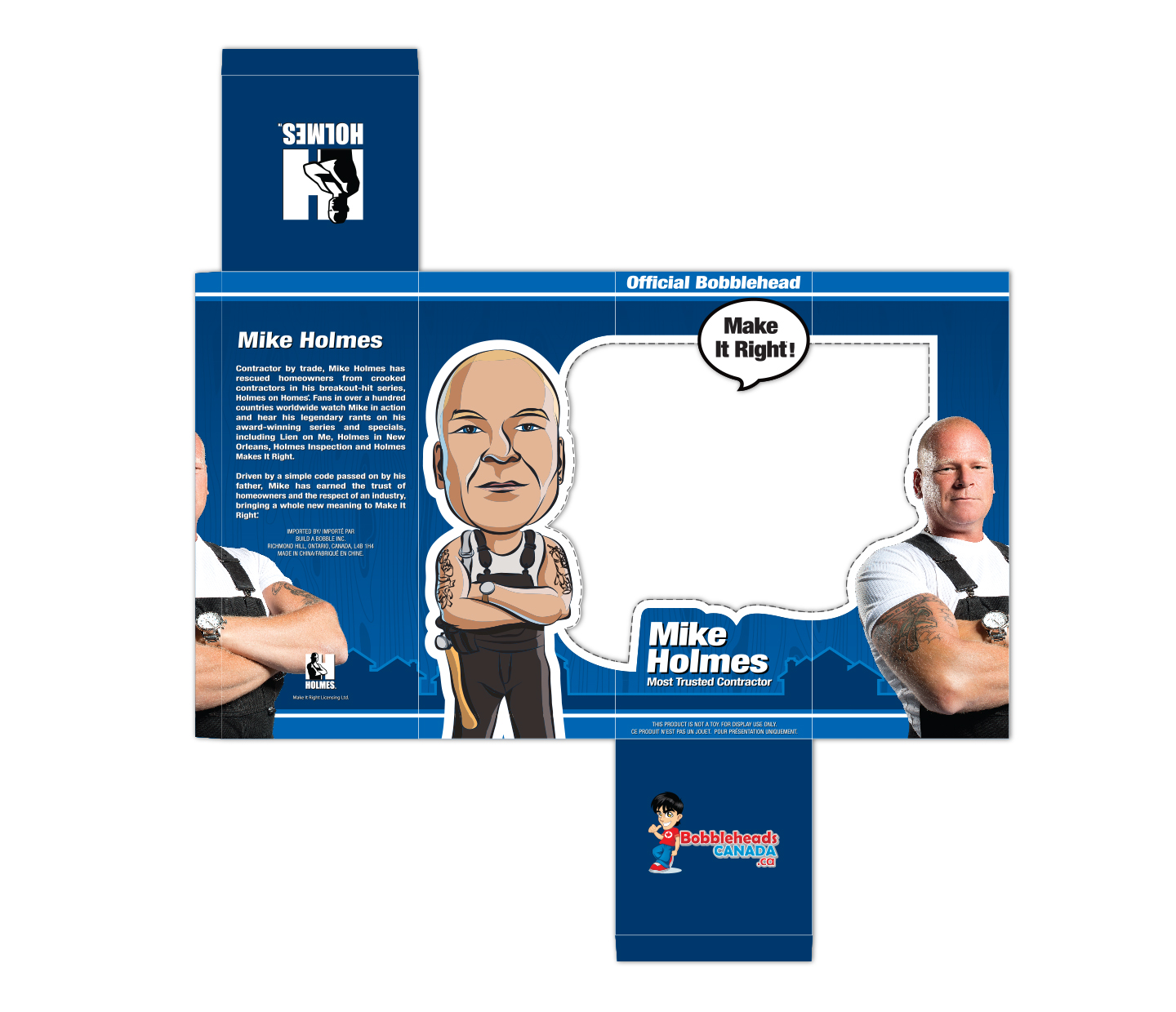
Packaging
“Creating the tattoos really helped make the bobblehead feel more like the real & “current” Mike Holmes so I’m happy they turned out, better than expected”.
More images for this project can be found in my portfolio under, Mike Holmes Official Bobblehead Packaging
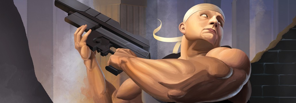
Brute War – Video Game Concept Cover
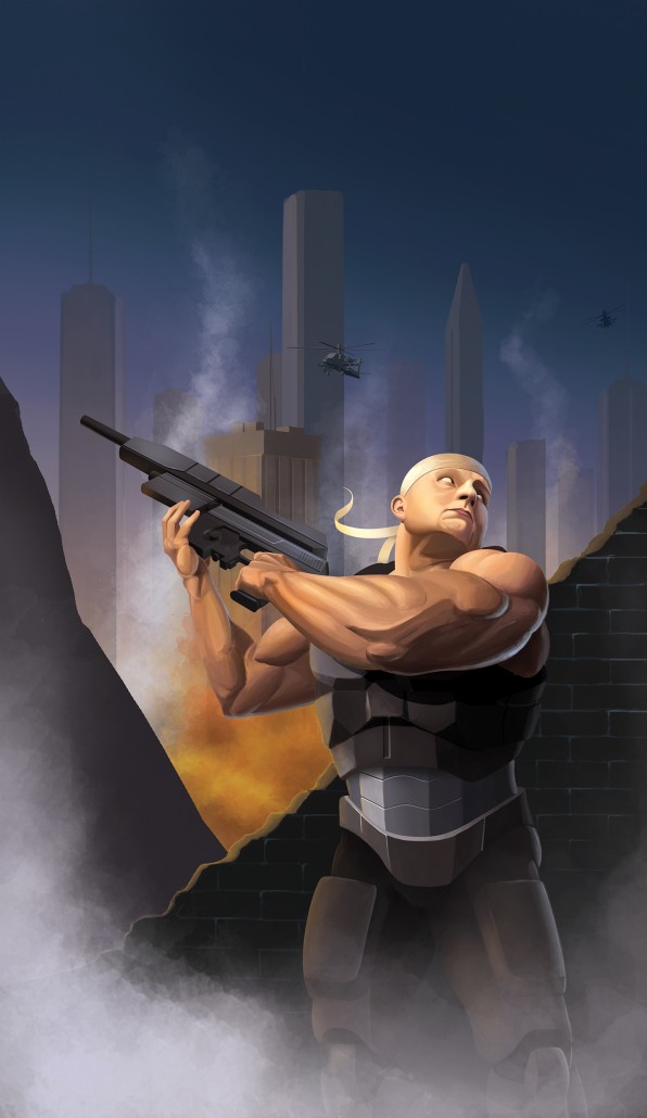
Brute War Cover
Brute War – Video Game Concept Cover, 2011
Newly added To Portfolio, Brute War – Video Game Concept Cover, Created for Sheridan College. Product Illustration
This project was created for Sheridan College in 2011 while I was still developing my portfolio. I was in my final year and was trying to round out my portfolio and I realized I didn’t have any good character Illustrations. A project came up to create a video game cover and I decided to go with something a little more current and not necessarily technically based. A project like this was fun but also daunting as I’m not to good with skin painting so I went a little more comic book with the tones. The character featured in this illustration is based on an image of myself. I wanted something that made the character look big but also displayed the atmosphere in which the character would exist in. I chose to go with an “up” angle to achieve that. Helicopters and buildings were added to fill the sky and create a much grander looking scene. The gun was modelled after the Heckler & Koch MK 23 along with a lot of modification. After some peer review it was noted that the weapon looked a little small in the characters hands. To fix this problem a large piece was added to the top of the Socom. This created more visual balance in the weight of the weapon compared to the character.
“The gun was modelled after the Heckler & Koch MK 23 along with a lot of modification. After some peer review it was noted that the weapon looked a little small in the characters hands. To fix this problem a large piece was added to the top of the Socom. This created more visual balance in the weight of the weapon compared to the character”.
Here is a process video showing how the leg armour evolved during the creation of this illustration. I start off pretty rough and then later fine tune it once i’m happy with it. I take a different approach with every illustration, sometimes I draw the whole character out and other times I draw parts and then go from there. Since I wanted to make sure I was happy with the skin – I did that first and then completed the other areas last.
More images for this project can be found in my portfolio under, Brute War – Video Game Concept Cover
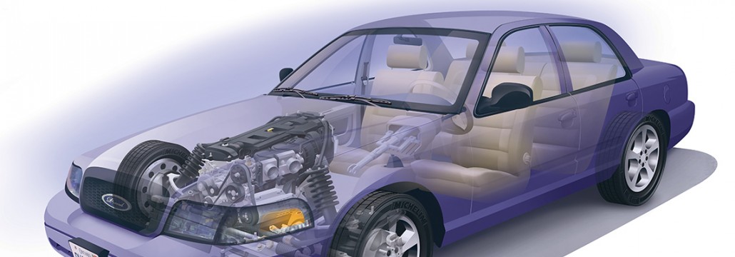
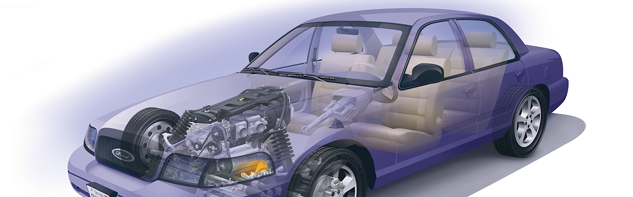
Modified Crown Vic, Vehicle Phantom View
Modified Crown Vic, Vehicle Phantom View, 2010-2011
Newly added To Portfolio, Modified Crown Vic, Phantom View, Created for Sheridan College. Technical Illustration. Automotive Illustration.
This project was created for Sheridan College between 2010-2011. Originally it started as a personal project to see how far I could take a phantom view illustration but inevitably turned into my thesis project for 4th year Illustration. The difficulties in creating an illustration of this magnitude occur when you try to gather reference material. Specific components are unique from car to car, so referencing pieces from a rear-wheel drive vehicle may be completely different from that of a front-wheel or all wheel drive vehicle. This is more true for this specific illustration because I didn’t just use references of a Ford Crown Vic. Many different parts were used from all sorts of manufacturers, from a Mazda engine to a Cadillac Catera interior. I went this way because I knew I wouldn’t have enough material for one specific car and I wanted to have a little fun with it at the same time.
“The difficulties in creating an illustration of this magnitude occur when you try to gather reference material. Specific components are unique from car to car, so referencing pieces from a rear-wheel drive vehicle may be completely different from that of a front-wheel or all wheel drive vehicle. This is more true for this specific illustration because I didn’t just use references of a Ford Crown Vic”.
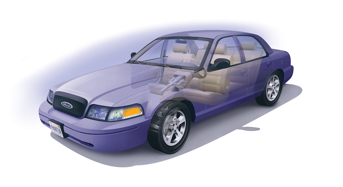
Interior, Drive Shaft Phantom View
Once most of my reference material was gathered I decided on the angle and view I wanted the car to appear on, a lot of this was based on the reference material itself as what I had to work from help dictate the final view (to some degree). The line work began in Illustrator CS5 starting with the body. From there I did print-outs to draw on top of which helped me map out where the rest of the components would go. The drive shaft and steering wheel were drawn in pencil at first and then traced in illustrator but other components like the engine and wheels I created directly in Illustrator. (I have no set method for creating an illustration, I’ll alternate from computer to pencil quite often. If one way isn’t working out I’ll switch to the other). From there I moved onto the wheels, drawing the individual treads took a great deal of time, I think I redid a couple wheels more than once too, chalk it up to a great learning experience that was all worth it in the end. After I was satisfied with that I started on the engine, the bread and butter of the piece. Fitting a Mazda engine inside a Crown Vic was quite challenging but I welcomed it, things went a lot smoother here surprisingly, it just took a lot of time. I think overall this whole piece took about 150+ hrs. The last part was the interior and extras that I borrowed from a Cadillac Catera specifically the cream colors used in the final piece. Coloring took place in Photoshop CS5 which was the fun part. I worked rather large, The final piece was made to be outputted at nearly 10ft wide which really hampers the RAM on your computer working at that size. You just have to deal with it and have patience.
“The drive shaft and steering wheel were drawn in pencil at first and then traced in illustrator but other components like the engine and wheels I created directly in Illustrator. (I have no set method for creating an illustration, I’ll alternate from computer to pencil quite often. If one way isn’t working out I’ll switch to the other)”
Once I had the piece close to completion I took it for some critiques, I made some modifications to the wheels, body and windows. It was a lot of extra work but it helped the final piece in the end. I presented this to the Adobe Design Achievement Awards, ADAA in 2011. An online award submission held by Adobe every year for current and recent graduates. I received a semi-finalist award for this piece and some good recognition. All in all I’m happy with the final drawing but I am looking forward to trying something a little different the next time I work on an illustration of this size.
More images for this project can be found in my portfolio under, Modified Crown Vic, Phantom View
Mike Holmes – Roofing Images, (Manual)
Mike Holmes – Roofing Images, (Manual), 2012
Newly added To Portfolio, Mike Holmes – Roofing, Manual, Created for The Holmes Group. Technical Illustration. Architectural Construction.
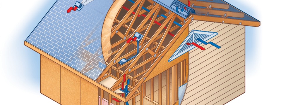
Below I’ve posted a small number of illustration I did for an illustrated home manual (I’ll post some more in the future) These Illustrations were to be kept simple, on a white background and the text kept as legible as possible as the images were going to be used in many different formats. Quite often the images were to be placed fairly small so it was imperative that the outlines and text maintain their qualities so the viewer wouldn’t lose any information.
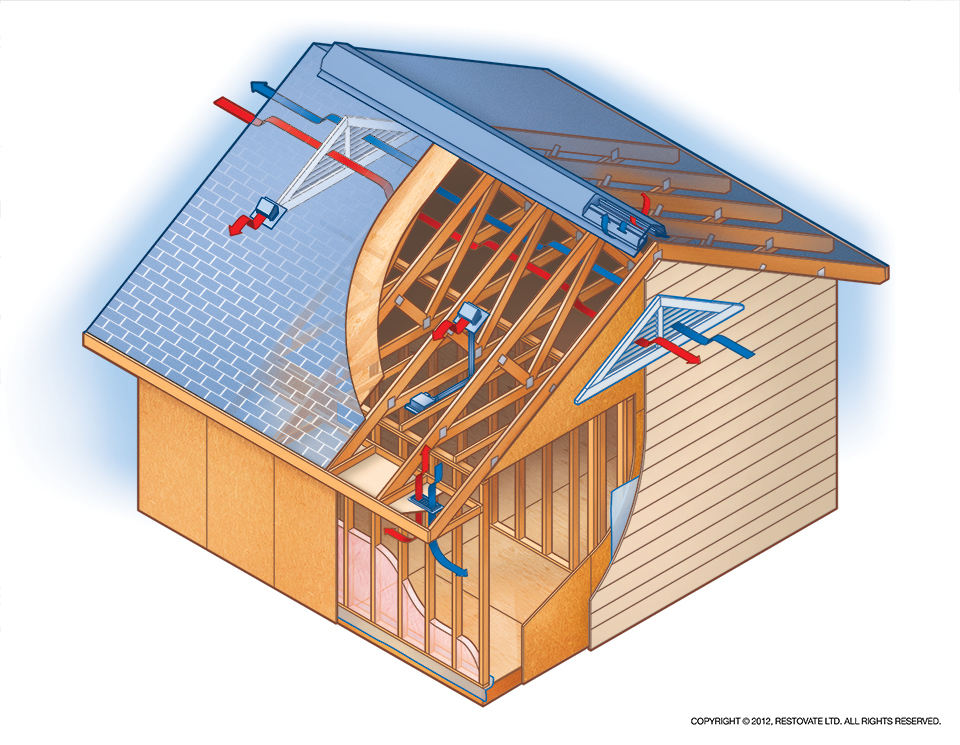
Above is an illustration showing roof vents and the purpose they serve. Roof vents are used to circulate air, keep the temperature in your attic mildly cool, protecting the climate inside your house and preventing ice dams from forming on top of your roof.
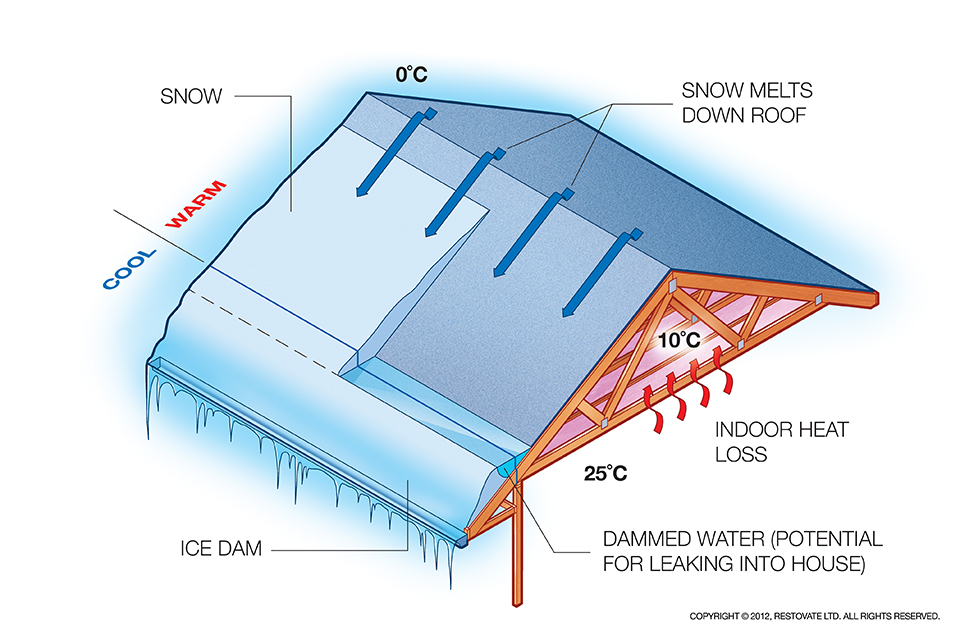
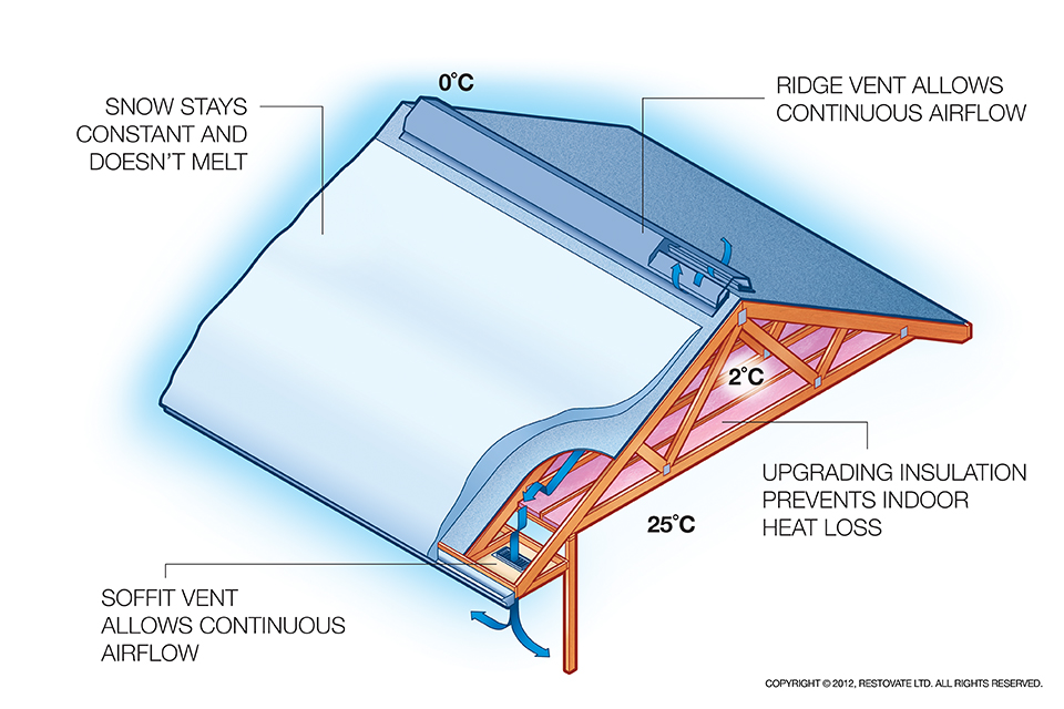
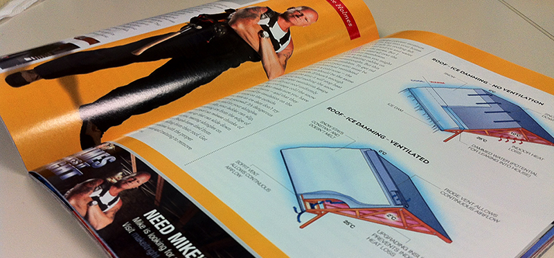
Speaking of which, the ice Damming Illustrations showing both ventilated and non-ventilated were featured in the February 2013 On The Go magazine which accompanied the Mike Holmes article titled “Ice Dams & Your Roof”
Quite often the images were to be placed fairly small so it was imperative that the outlines and text maintain their qualities so the viewer wouldn’t have to compromise on information.
Below is an excerpt from the article on Ice Damming –
“Ice dams prevent water from flowing down. It will eventually back up, finding its way under the shingles and into the attic. A thick ice dam can damage roof flashing, fascia and soffits. It can even shift vent stacks and create gaps that allow water into your roof. that water can flow into your exterior wall cavities and end up in your basement. Or it can leak into your home and cause damage to walls, ceiling and insulation”
-Mike Holmes, On The Go Magazine, February 2013
Recent Comments