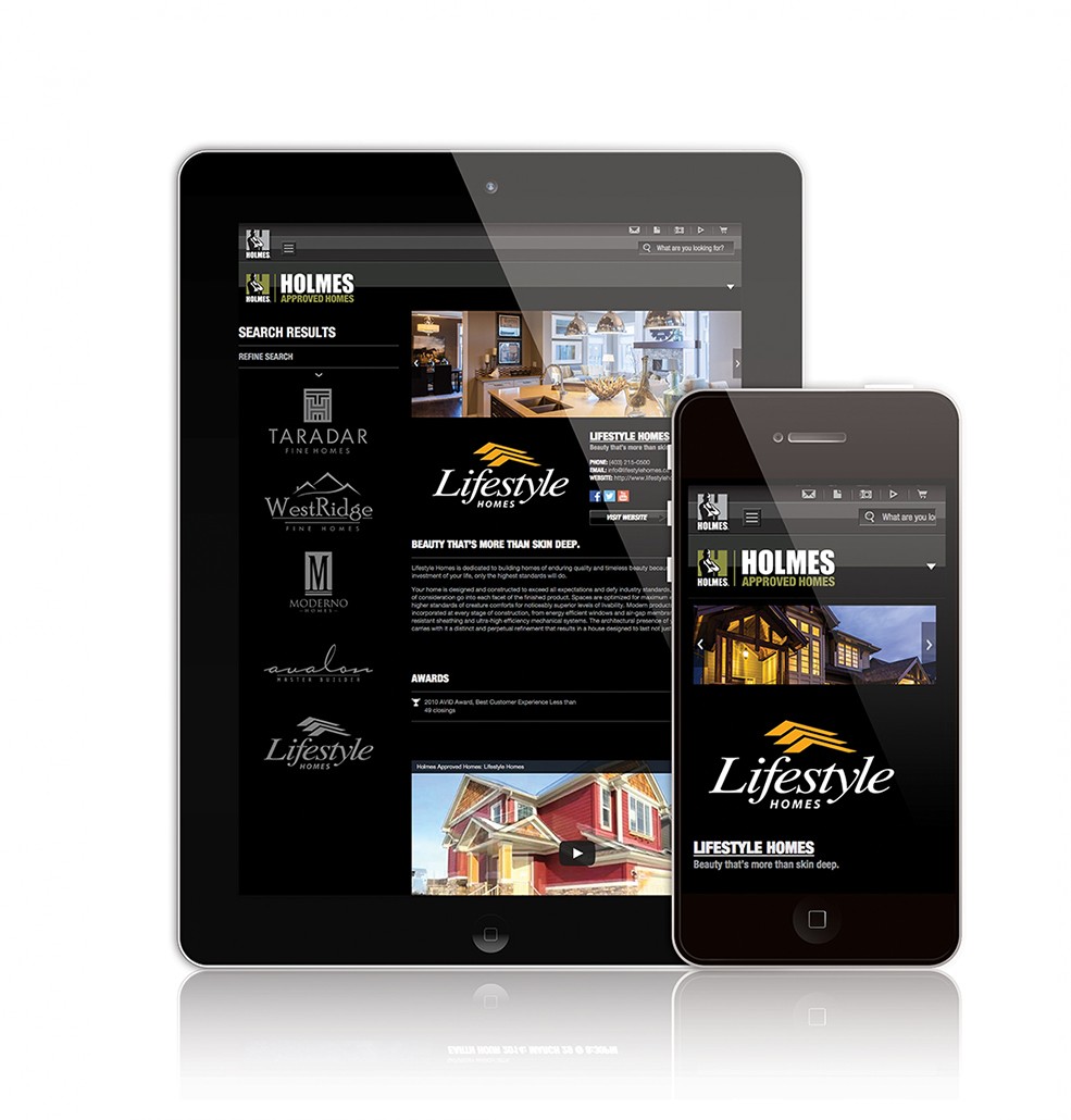
Holmes Approved Homes Responsive Web Site
Newly added to Portfolio, Created For Holmes Approved Homes 2014. Web Design. A couple of screenshots demonstrating the new responsive HAH Website. 
Newly added to Portfolio, Created For Holmes Approved Homes 2014. Web Design. A couple of screenshots demonstrating the new responsive HAH Website. 
Makeitright.ca Responsive website, 2014
Newly added To Portfolio, MakeitRight® Responsive website, Created for The Holmes Group. Web Design
This is a project that I’ve been working on for a fairly long time and one which is still ongoing. I had the opportunity to completely overhaul the previous version of makeitright.ca. A website that was created in the days of the now defunct flash. It was a daunting task at first glance. The site is fairly large with many sections – resources, current productions, services, photos, videos, news a webstore and a non-profit foundation section. Not to mention trying to retro-fit old tv-show pages to work within the new responsive template. Working with the communications team here at the Holmes Group, we were able to categories and map out the sections accordingly, a task that took probably just as long as the design process itself.
The site is fairly large with many sections – resources, current productions, services, photos, videos, news a webstore and a non-profit foundation section.
The design process started with the Webstore. A Section which exists independently of the main site Using OS Commerce. This was a good starting point for the redesign as it allowed us to narrow down the design elements needed for the new site. Everything started with the Global Navigation menus for both desktop and mobile versions. Once this was decided we began testing in-house to see how things would work and flow together.
After the webstore was completed which was about 5 months beforehand, we moved onto the homepage and main navigational pages. (We held off on the webstore launch in the meantime, due to issues regarding member login accounts and the confusion around christmas time.)
One of the more interesting bits in the design process was coming up with the flow of photogallery section. Photographers like photos to be displayed at their best resolution possible which is not only hard to do for web but even harder to do while creating a responsive website. I came up with the concept below to try and create that balance between print ready and web friendly quality photos. The Technical line drawing below was given to a team of developers at trademark5150 to help them better understand the flow of the photo pages. It also helped me to design the page so it would work for this format. (Form vs Function!) In MIR photo gallery comp desktop you can see the working stages vs the final stage of both the photogallery index page and the gallery itself.
The way the photo gallery pages worked on the tablet and mobile versions also had to be consider. Here you can see that process.
Photographers like photos to be displayed at their best resolution possible which is not only hard to do for web but even harder to do while creating a responsive website.
More images for this project can be found in my portfolio under, MakeitRight® Responsive Web Design.

Recent Comments