Biomimicry, Armadillo Lizard ATV
Biomimicry, Armadillo Lizard ATV, 2010
Newly added To Portfolio, Biomimicry, Armadillo Lizard ATV, Created for Sheridan College. Technical Illustration. Scientific Illustration. Automotive Illustration. 3D.
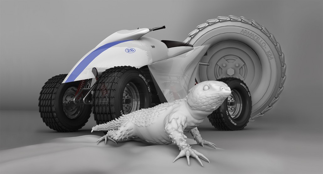
This project was created for Sheridan College in 2010, it focused on the term Biomimicry. “The design and production of materials, structures, and systems that are modelled on biological entities and processes”. Based on this term I was tasked to come up with an idea that borrowed from biological life. Originally I had the idea to utilize an electric eels natural defense, the electric shock which can generate up to 600 volts of electricity. I wanted to convert this energy into horsepower somehow but couldn’t get past the numbers needed to compete with similar vehicles of its kind.
This project focused on the term Biomimicry. “The design and production of materials, structures, and systems that are modelled on biological entities and processes”.
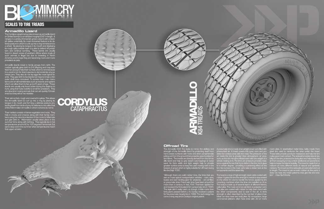
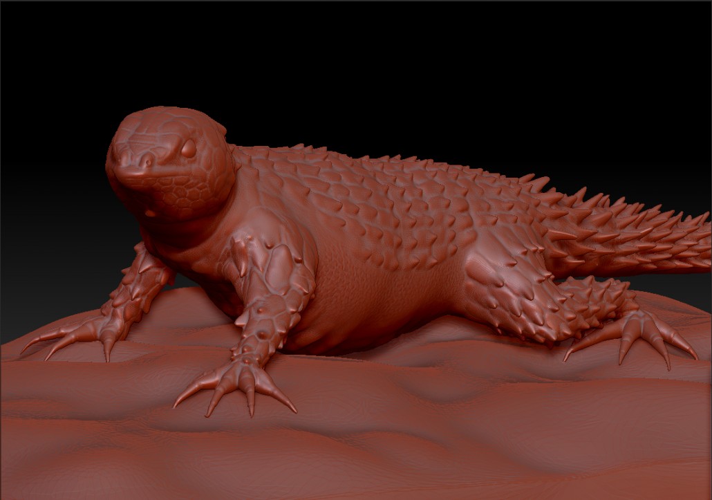
After compiling all that data I decided to scrap the entire idea in favor of something a little more visual. I began researching other biological entities that I could still apply to a motorized vehicle and then came across the Armadillo Lizard. This lizard interested me specifically because of it’s main defensive against predators. “This heavily armoured reptile is named after the armadillo for its ability to roll itself into an almost impregnable ball when threatened. In this position, the spiny scales covering the neck, body and tail are presented to any potential predator, protecting the soft belly” -Arkive.org
“This heavily armoured reptile is named after the armadillo for its ability to roll itself into an almost impregnable ball when threatened”.
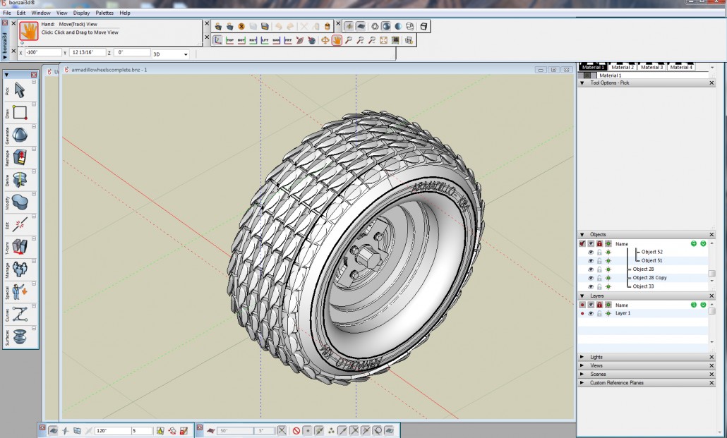
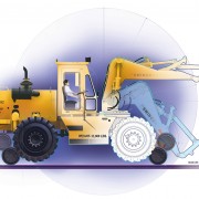
I came to the conclusion that this would be a great idea for a new tire that would work really well for an off road type of vehicle, so I began drawing up concepts of an ATV. I started with a few side profile sketches to get some ideas flowing quickly, Once I had something I was interested in, I would take it to the next step by drawing it in 3 dimensions. This would enable me to see how the machine would look and flow in a more realistic space. I treated both the body of the machine and the tire treads as one entity so as to create better flow between the two.
“I started with a few side profile sketches to get some ideas flowing quickly, Once I had something I found interesting I would take it to the next step by drawing it in 3 dimensions. This would enable me to see how the machine would look and flow in a more realistic space”.
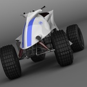
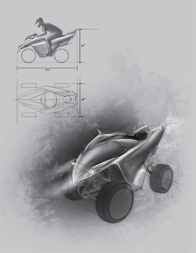 I worked mainly from my own reference sketches to create the finished ATV and tire. Taking the profile sketches into 3 dimensions was probably the most crucial piece because that was where I began to see how everything was going to fit together. From this I was able to create the 3D model without running into too many unforeseeable problems and saved quite a bit of time creating the final piece.
“Taking the profile sketches into 3 dimensions was probably the most crucial piece because that was where I began to see how everything was going to fit together”.
More images for this project can be found in my portfolio under, Biomimicry, Armadillo Lizard ATV


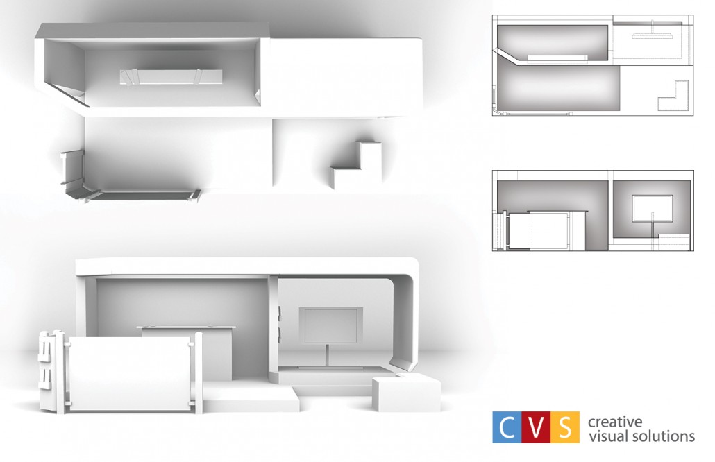
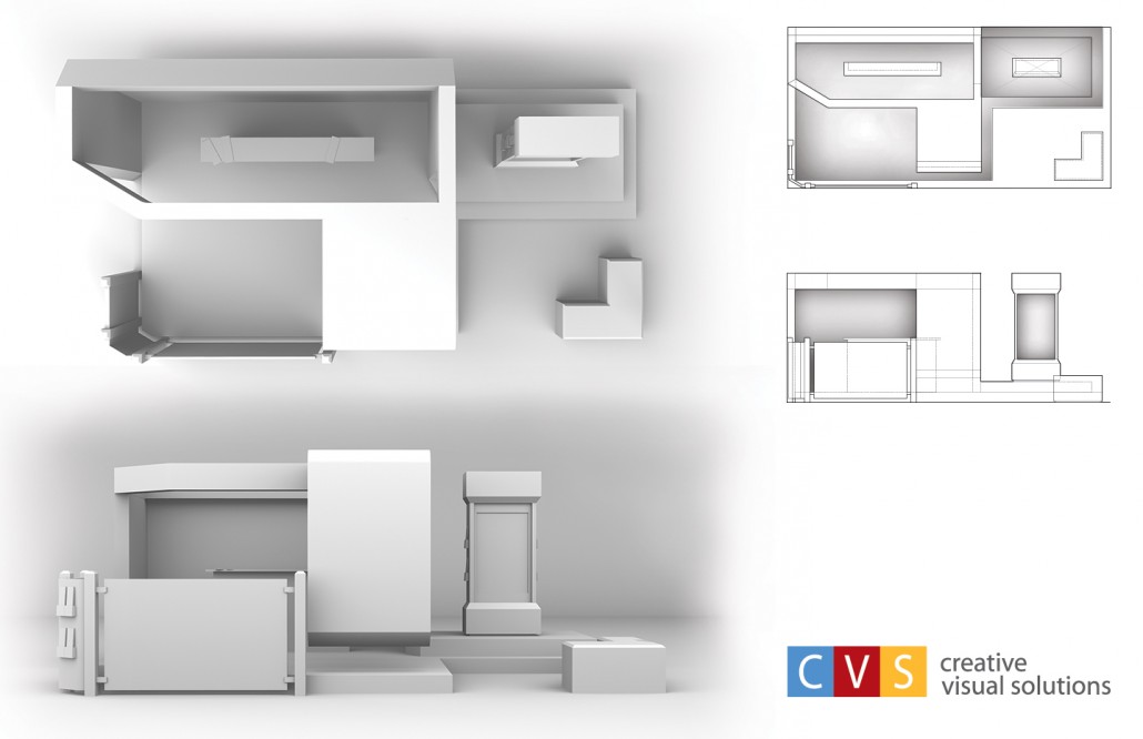 The earlier design to the left came from a side profile sketch that didn’t include the front glass barrier and brochure stand. As other elements were added the design became less organic and front heavy like it would topple over. Changes were made to make it more open and inviting to guest. In the final design the Monitor on the right was given some walls to keep sound isolated to guest seated at the small box seats which also doubled as storage bins.

Recent Comments