03_FARMHOUSE_WEBSQAURE

Holmes Approved Homes Inspection Stages

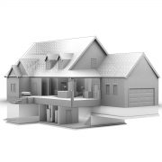
Newly added to Portfolio, Illustration/Model demonstrating the different inspection stages of the Holmes Approved Homes Certification Program.

Foundation: This is a detailed inspection of the structure that supports your entire home: the foundation—from the footings to the waterproof membrane system. This inspection protects your home’s resistance against moisture and basement leaks.

Durability: Your home’s exterior building wrap is inspected to ensure maximum mould and moisture protection. Electrical, plumbing and HVAC rough-in stage inspections are also conducted to confirm they have been properly installed.

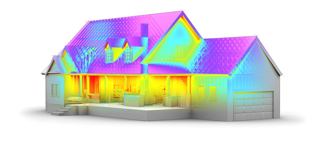
Energy Efficiency: This inspection tests every part of your home’s construction that has a direct impact on its energy efficiency, including a tight building envelope and sealed air ducts, as well as maximized heating and cooling.

04_FARMHOUSE_ENERGYEFFICIENCY_Websmall

Roof Inspection: A full review of your home’s roof installation is completed, including soffits, trim, gutters and downspouts. This confirms they meet manufacturer warranty conditions to protect your home for generations.

Final Inspection: Your entire home is inspected to make sure it meets every one of Mike’s specifications. This inspection verifies minimum water infiltration, maximum moisture protection and proper ventilation systems for maximized indoor air quality.

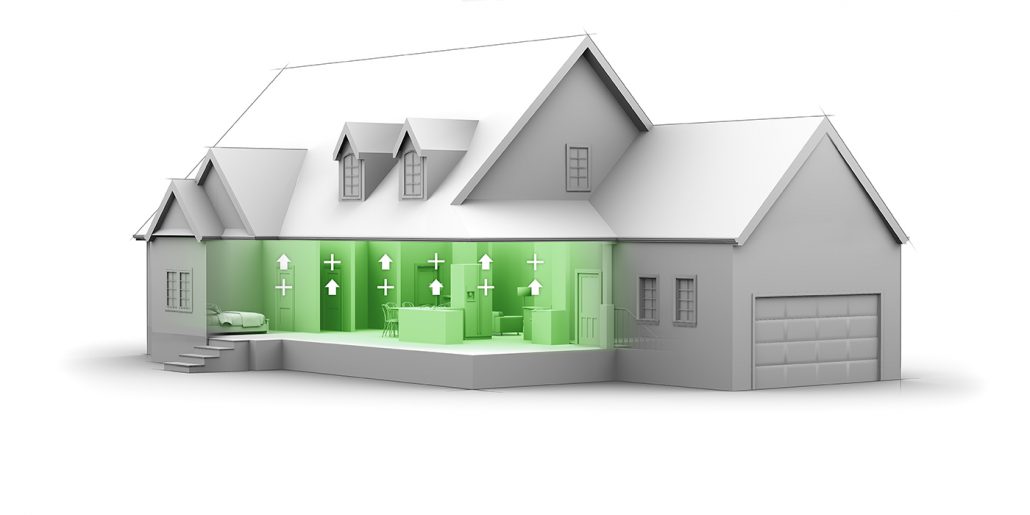
Healthy Home: As a final inspection, your home is examined to make sure safer, healthier, more durable materials were properly installed—from paints, appliances and flooring to the HVAC and water purification systems.


07_FARMHOUSE_HEALTHYHOME_websmall

You can find more information on at  www.holmesapprovedhomes.com


Compilation Oil Rig with Orthographics

Oil Rig Model

Oil Rig Model, 2010.

Created for Sheridan College

Exterior Oil Rig


This Project was created to test some exterior elements using bonzai3D and the rendering capabilities of Strata Cx5 at the time.

It was later compiled together in PhotoshopCS5.


More Images from this project, can be found in the portfolio section.  Portfolio


Technical Illustrator

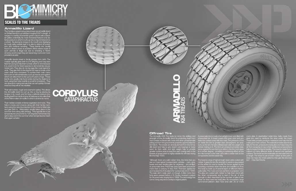
Biomimicry, Armadillo Lizard ATV

Biomimicry, Armadillo Lizard ATV, 2010

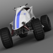
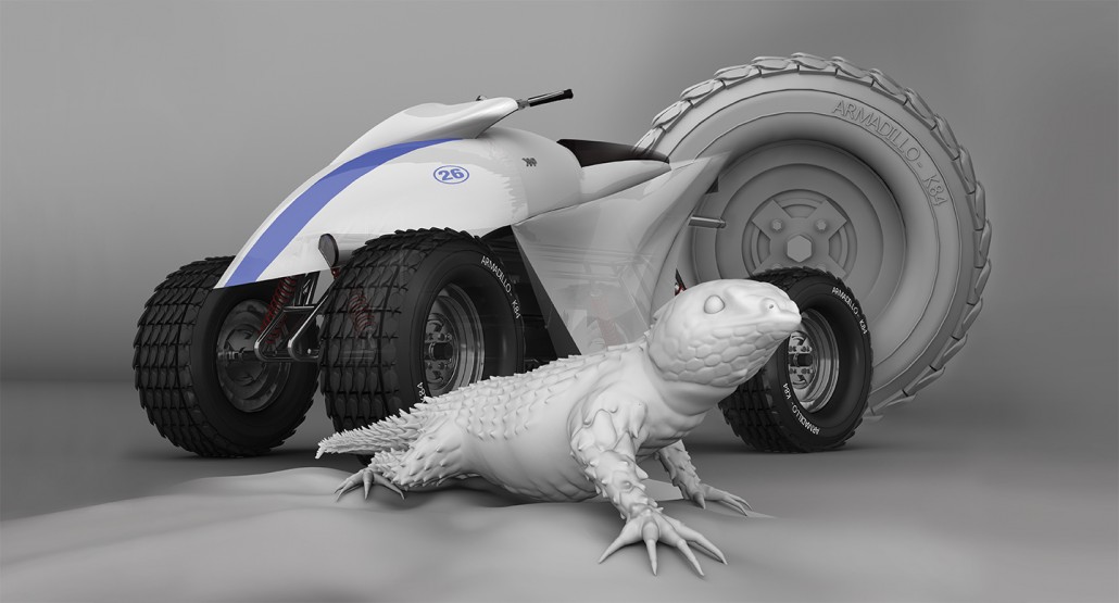
Newly added To Portfolio, Biomimicry, Armadillo Lizard ATV, Created for Sheridan College. Technical Illustration. Scientific Illustration. Automotive Illustration. 3D.

This project was created for Sheridan College in 2010, it focused on the term Biomimicry. “The design and production of materials, structures, and systems that are modelled on biological entities and processes”. Based on this term I was tasked to come up with an idea that borrowed from biological life. Originally I had the idea to utilize an electric eels natural defense, the electric shock which can generate up to 600 volts of electricity. I wanted to convert this energy into horsepower somehow but couldn’t get past the numbers needed to compete with similar vehicles of its kind.

Technical Illustrator

This project focused on the term Biomimicry. “The design and production of materials, structures, and systems that are modelled on biological entities and processes”.

Technical Illustrator

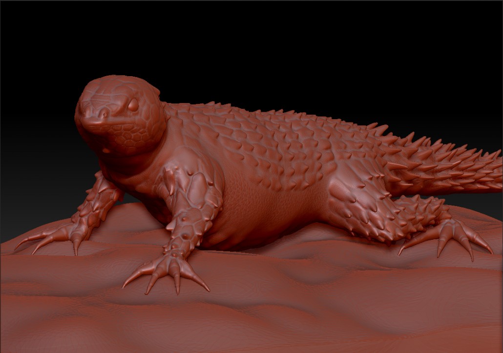
After compiling all that data I decided to scrap the entire idea in favor of something a little more visual. I began researching other biological entities that I could still apply to a motorized vehicle and then came across the Armadillo Lizard. This lizard interested me specifically because of it’s main defensive against predators. “This heavily armoured reptile is named after the armadillo for its ability to roll itself into an almost impregnable ball when threatened. In this position, the spiny scales covering the neck, body and tail are presented to any potential predator, protecting the soft belly” -Arkive.org


“This heavily armoured reptile is named after the armadillo for its ability to roll itself into an almost impregnable ball when threatened”.

Technical Illustrator

Technical Illustrator

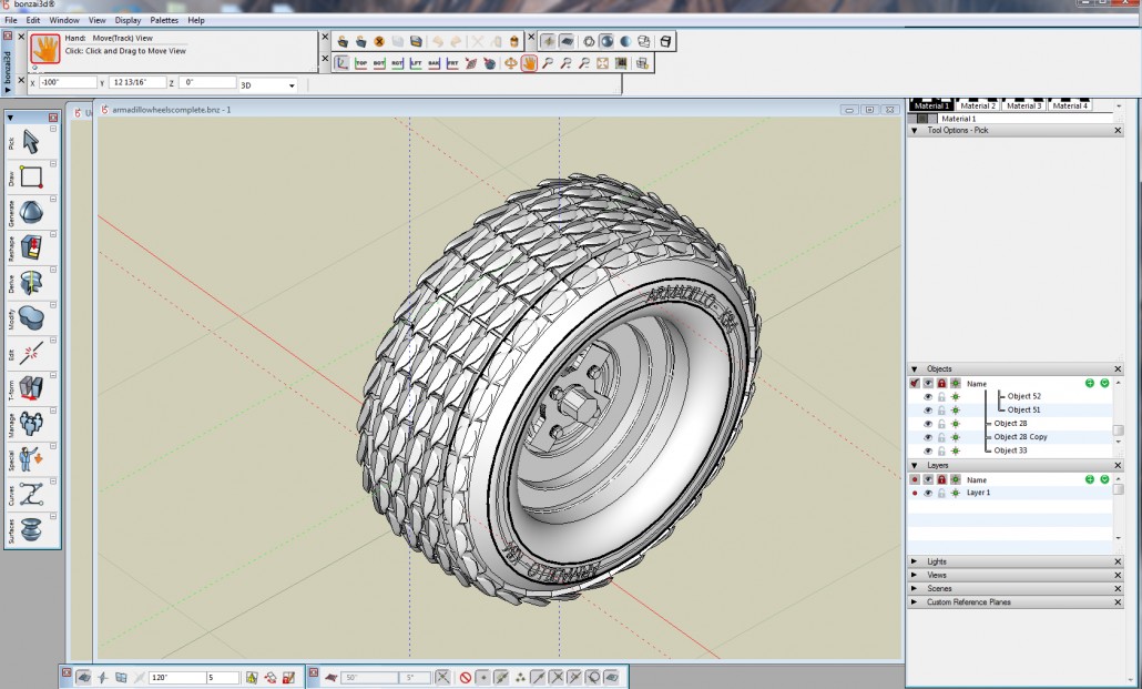
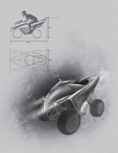
I came to the conclusion that this would be a great idea for a new tire that would work really well for an off road type of vehicle, so I began drawing up concepts of an ATV. I started with a few side profile sketches to get some ideas flowing quickly, Once I had something I was interested in, I would take it to the next step by drawing it in 3 dimensions. This would enable me to see how the machine would look and flow in a more realistic space. I treated both the body of the machine and the tire treads as one entity so as to create better flow between the two.


“I started with a few side profile sketches to get some ideas flowing quickly, Once I had something I found interesting I would take it to the next step by drawing it in 3 dimensions. This would enable me to see how the machine would look and flow in a more realistic space”.


Technical IllustratorI worked mainly from my own reference sketches to create the finished ATV and tire. Taking the profile sketches into 3 dimensions was probably the most crucial piece because that was where I began to see how everything was going to fit together. From this I was able to create the 3D model without running into too many unforeseeable problems and saved quite a bit of time creating the final piece.
“Taking the profile sketches into 3 dimensions was probably the most crucial piece because that was where I began to see how everything was going to fit together”.


More images for this project can be found in my portfolio under, Biomimicry, Armadillo Lizard ATV

Technical Illustrator


Technical Illustrator

CVS Trade Show Booth

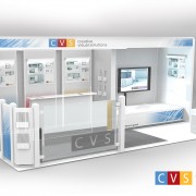
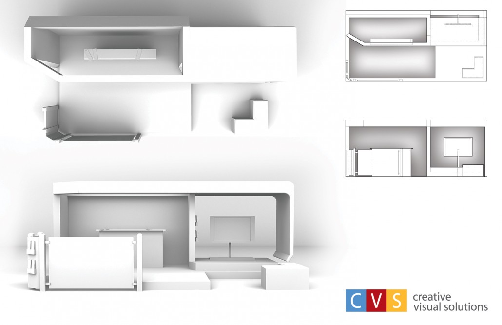
CVS Tradeshow Booth I created back in 2010

Newly added To Portfolio, CVS Trade Show Booth, Created for Sheridan College & Creative Visual Solutions.  Technical Illustration. Architectural Construction.  3D.


Technical Illustrator

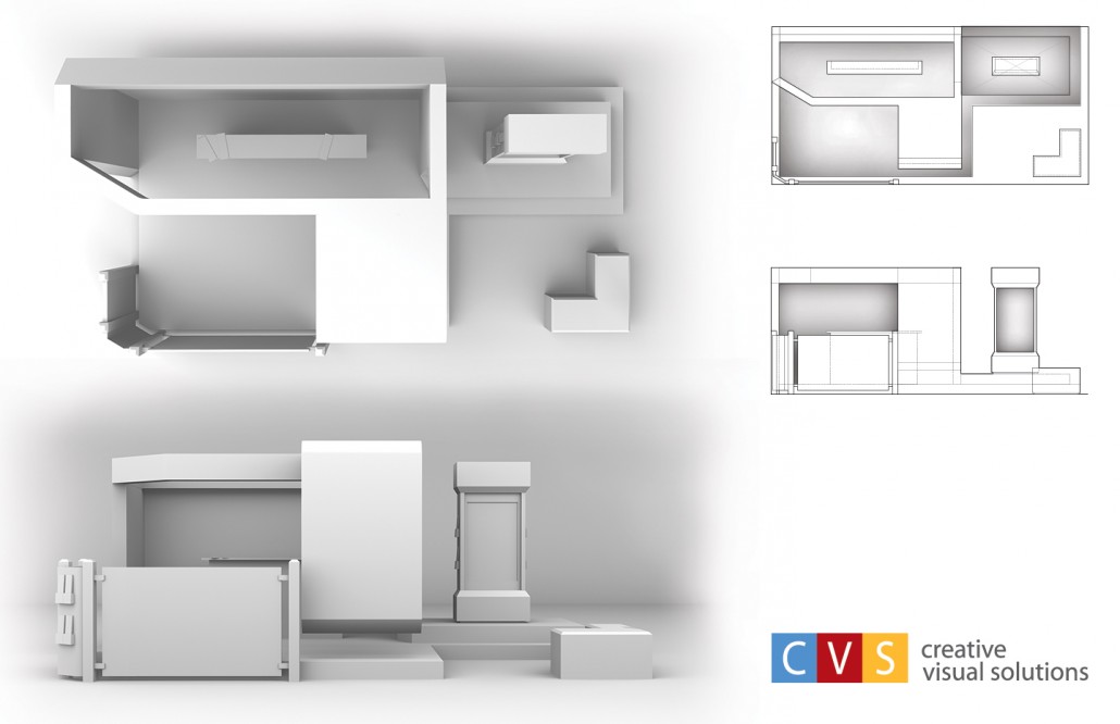
The idea behind this project was to design a booth that was unique enough to stand out – but also one that could fit within the strict dimensions and guidelines of most trade show events whilst still being modular.

The size dimensions of the booth needed to fit within a 10x20ft space with about an 8ft ceiling, which is pretty common for most trade show spaces. In the original design, the roof stretched overtop of the monitor and floated just inches above the floor.  As the concept grew, changes needed to be made.  More thought was put into the construction and stability benefiting the overall design.


The size dimensions of the booth needed to fit within a 10x20ft space with about an 8ft ceiling, which is pretty common for most trade show spaces.


Technical IllustratorThe earlier design to the left came from a side profile sketch that didn’t include the front glass barrier and brochure stand.  As other elements were added the design became less organic and front heavy like it would topple over.  Changes were made to make it more open and inviting to guest.  In the final design the Monitor on the right was given some walls to keep sound isolated to guest seated at the small box seats which also doubled as storage bins.
Vibro_Lg_Fan_01

VibroAcoustics – Vibration Isolation and Restraint Systems

Completed some work for VibroAcoustics a couple months ago and they just released their vibration isolation and restraint systems brouchure

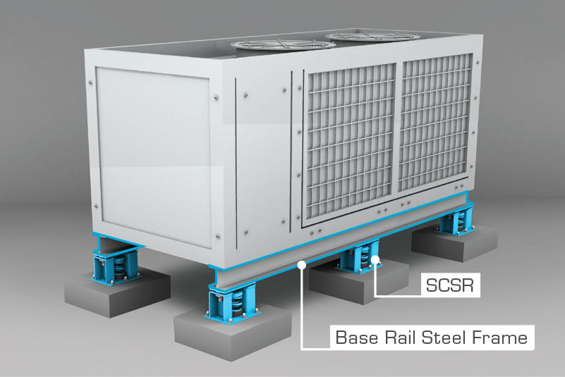
Newly added To Portfolio, Vibration Isolation and Restraint Systems. Created for VibroAcoustics.  Technical Illustration. Architectural Construction.  3D.


Vibro_05

I was contacted by VibroAcoustics last November to complete 12 Illustrations that showcased their various vibration isolation and restraint systems.  I started with their base mounted products first.  The idea was to keep it simple and in a greyish tone so that color could be used to highlight the various components of the system used to support and minimize sound in HVAC systems.


More about the company:

“Drawing on over 50 years of experience, Vibro-Acoustics focuses chiefly on providing the application engineering expertise and product solutions needed to achieve the desired sound criteria. This requires our Application Engineers to address both structure-borne and airborne noise.

“Vibro-Acoustics focuses chiefly on providing the application engineering expertise and product solutions needed to achieve the desired sound criteria. This requires our Application Engineers to address both structure-borne and airborne noise”.

Vibro-Acoustics writes project-specific specifications for vibration isolation, seismic/ wind restraint and airborne noise to save engineers time when reviewing submittals and to help avoid vibration problems post-design. Vibro-Acoustics also serves as a single point of contact for meeting sound criteria and for ensuring solutions are code compliant”.

http://www.vibro-acoustics.com/ 


kevinprendergast.com

Macro Nutrition – Iso-Synth, Product Packaging

Newly added To Portfolio, Macro-Nutrition Product Packaging Created for Sheridan College.  Product Design, Graphic Design, Technical Illustration.

Full product concept.  Macro Nutrition – Container concept modeled in Bonzai 3D, graphic wrap created in Illustrator and Photoshop.

This started as an assignment to develop product packaging for an idea that focused on 3 Flavors.  I decided to develop a concept for a Nutritional company, creating the Full Branding image.  From the Logo’s, Products, Flavours & Containers.  A lot of reference was placed towards pre-existing Health & Wellness companies, mainly the MuscleTech & Optimum Nutriton brands.  They’re designs are pretty fresh and up to date compared to a few of the lesser known brands.  After I had my reference material, I went into creating the container  – which was pretty simple. The container was designed so the lids would cup the next container that sat above it, Creating a more balanced display when placed in a store setting.  There also was some thought put into the inside of the container that showcased how the protein would have been dispersed for a mixed container.  Something that I haven’t seen done yet.  (I’ll update the gallery with a photo of this example shortly).  After I completely this stage I created the logo and decided on the flavours for the proteins.  The fruits were created in Illustrator & Photoshop and then placed onto a rough design of the label which I knew would wrap around the containers.  A little bit of graphic design & it was ready to be mapped onto the 3D model & rendered out.