20200413_145322

SUPER SISTERS ARCADE

SUPER_SISTERS_ARCADE_CABINET

Follow along in the process of building The Super Sisters Arcade Cabinet


REMINISCING

THE EARLY YEARS


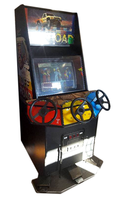
Back in the late 80’s and early 90’s I remember walking to the corner store with my parents so they could buy packs of King sized Du Maurier’s for their bad habits. I would ask my parents for some extra change for the arcade that was sitting near the door.  One of the earliest games that I remember playing was Ivan “Ironman” Stewart’s Super Off Road. This game had 3 steering wheels attached to it and it looked amazing! I could barely see over the controls to play, but it gave me that chance to feel like a racecar driver and I was willing to stand on my toes to do it!

OFFROAD

My second introduction to arcade gaming was with my Aunt.  Whenever I would visit her, she would take me to an old sub and sandwich cafe. Inside was a Pacman cocktail cabinet. I had never seen anything like it, I was able to eat an entire sub on top of it while running away from ghosts! As I grew up I saw games like Mortal Kombat change the gaming scene by digitizing photos for graphics and Killer Instinct up the gaming industry with their unique combo system. I remember playing KI inside Sam the Record Man’s Record store in Toronto. They had a couple of cabinets hidden away upstairs – this was years before the iconic store closed down. Reliving these memories as a dad made me think about my own kids and how fun it would be to share some of those experiences with them.

After seeing a lot of the DIY cabinets online, it inspired me to try making one myself. I had an old PC laying around from 2006 and a cheap tv monitor collecting dust on top of a dresser upstairs and I thought to myself I can do this!… Because of the quarantine from the Coronavirus,  I finally had some downtime to actually start planning and building the cabinet.


PLANNING

PEN TO PAPER

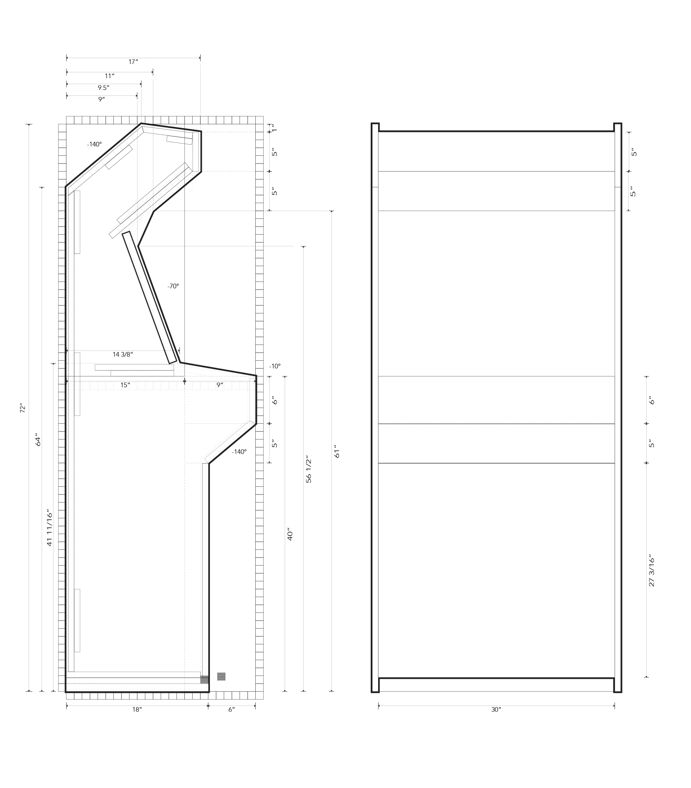
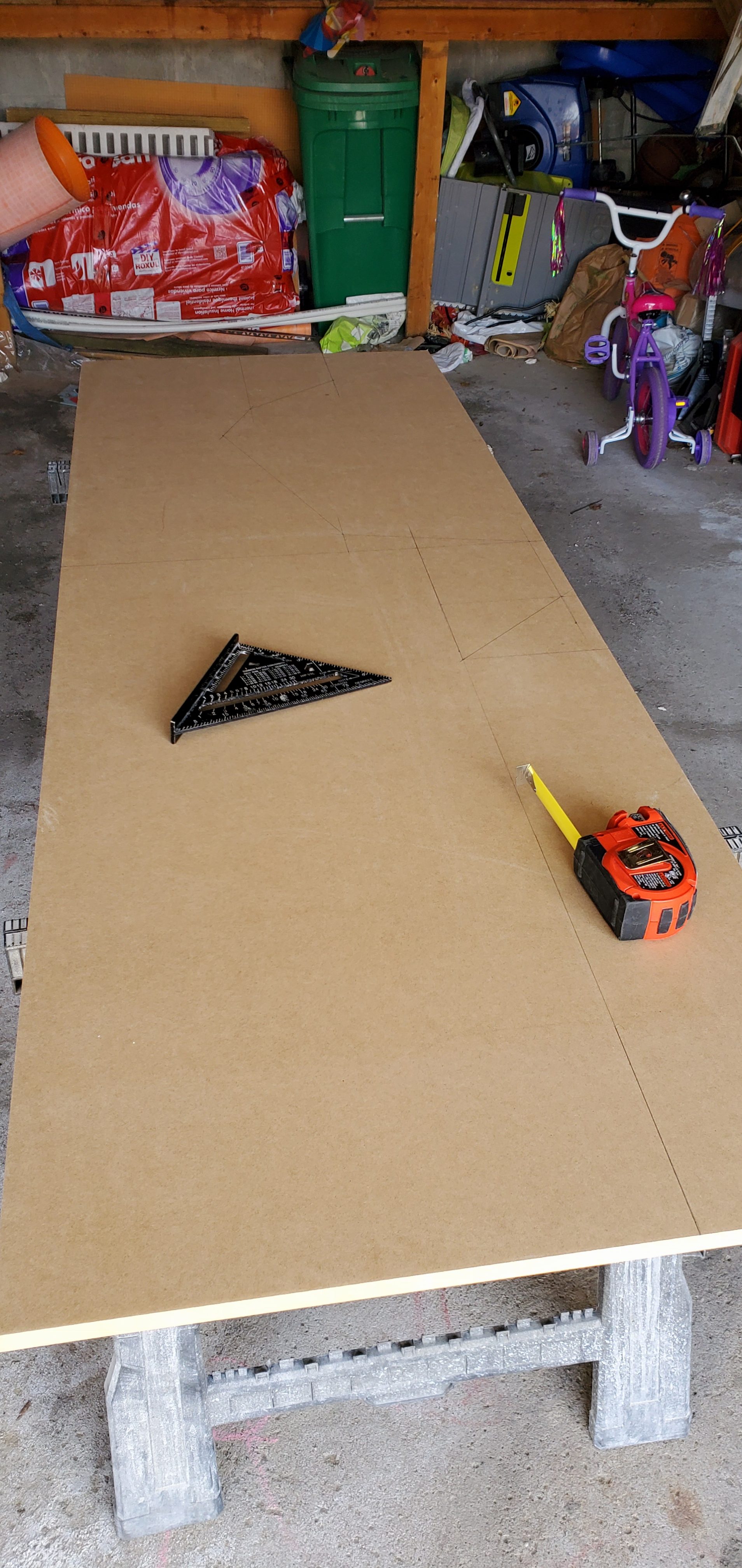
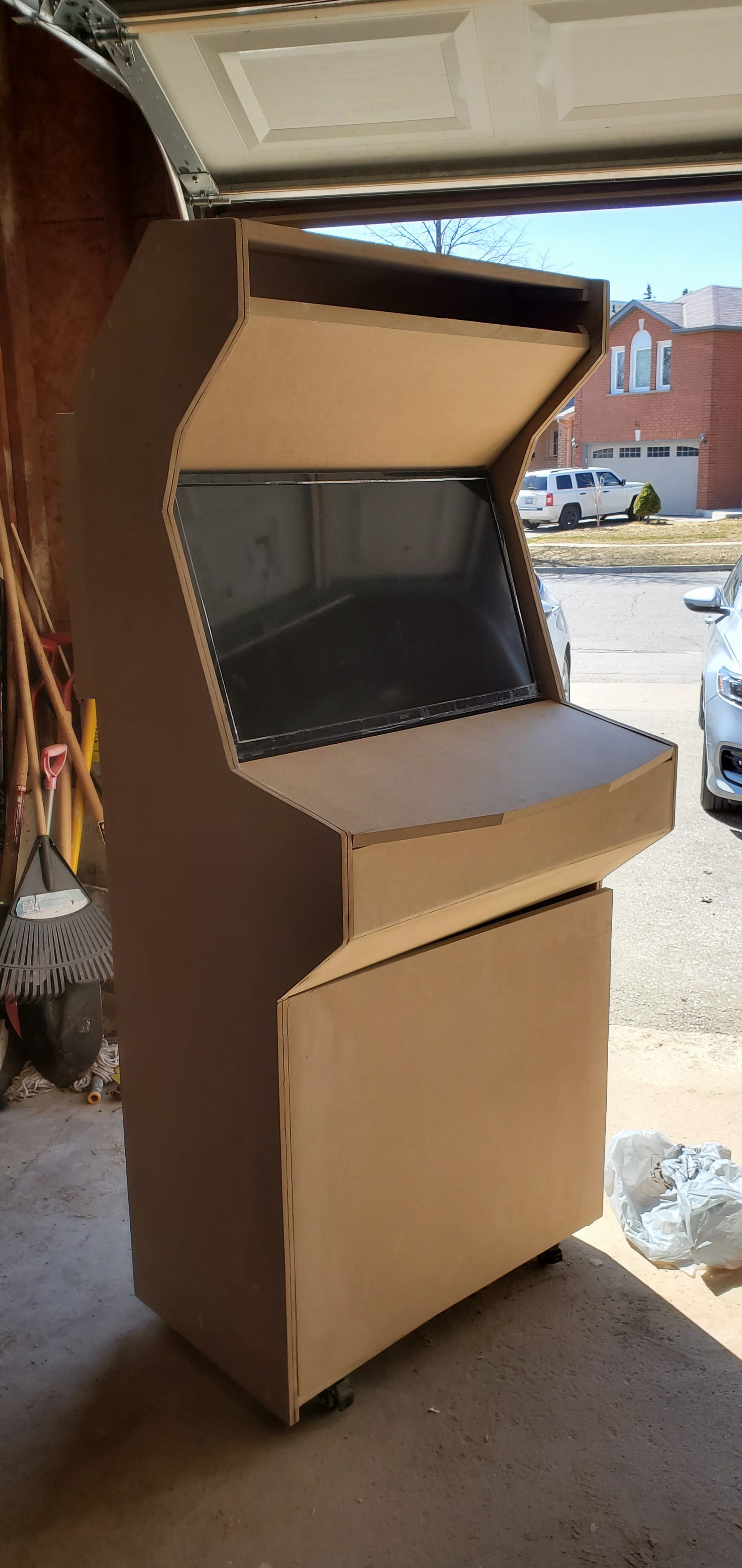
I first researched a lot of cabinets online to find out what kind of shape I wanted. I preferred something classic but not too bulky.  The old cabinets were bulkier due to the CRT televisions, mine only needed to house a LCD screen so I knew I could cut back on thickness. Once I had enough reference material I began with some rough sketches on paper. I kept in mind things like counter heights and door widths so I would be able to move this inside once it was finished. The overall design ended up being 30″x72″x24″. This also allowed me to maximize material use while minimizing its cost as I was able to fit two panels on a single sheet of 4’x8′ MDF.

20200413_212459

THE BUILD

SAW SOME DUST

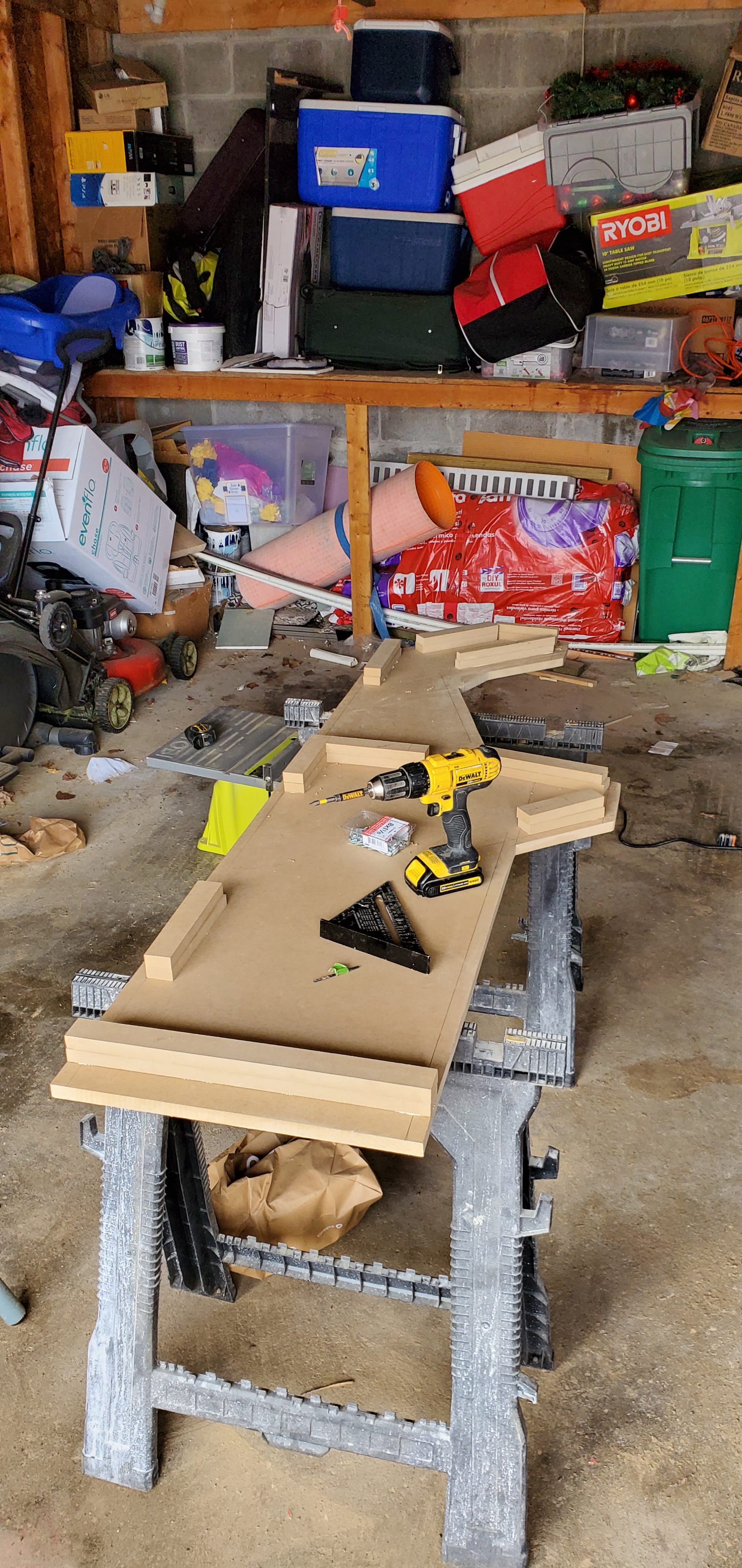
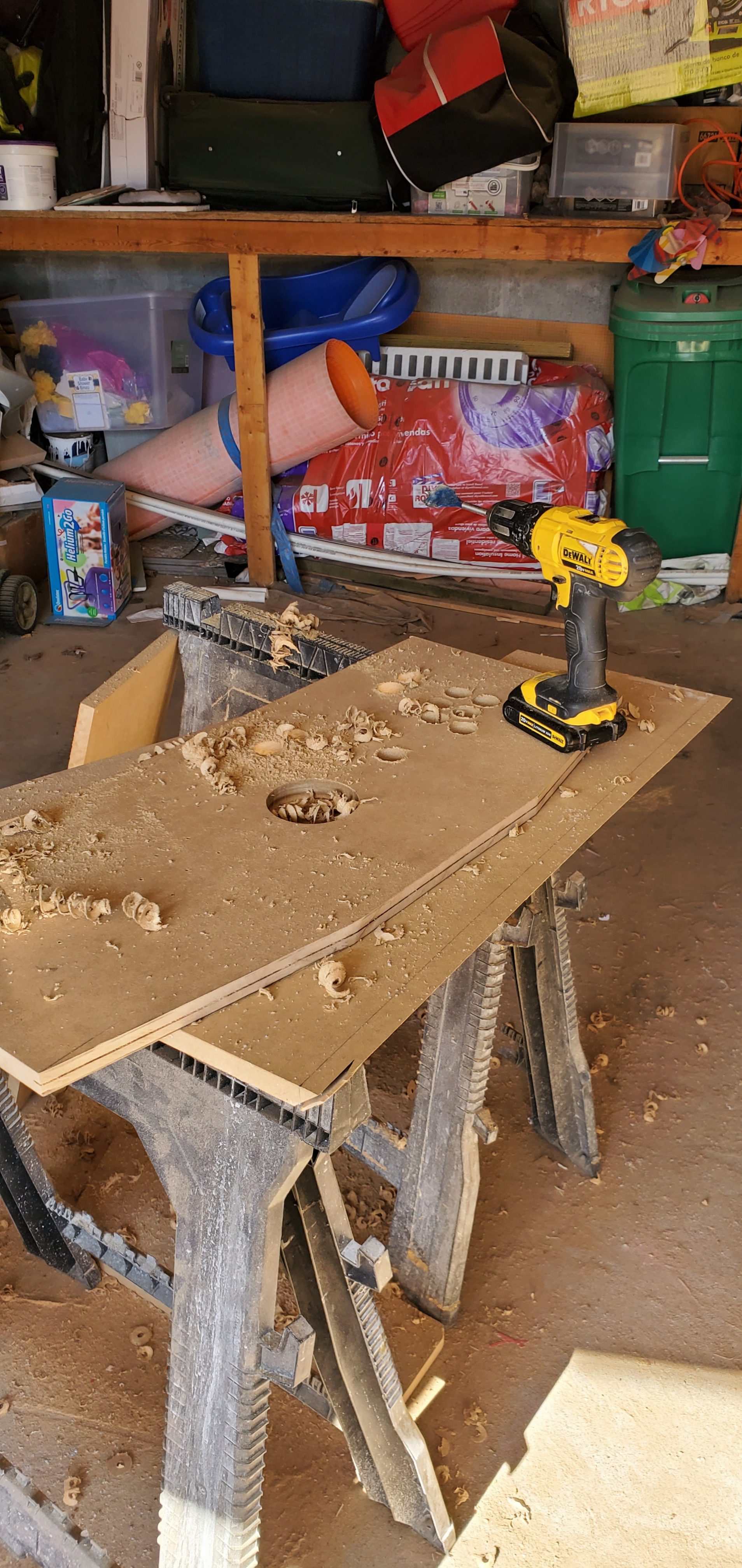
I used the measurements from the planning phase and plotted them down onto the MDF sheet.  I cut along the line using a jigsaw.  Once the first sheet was cut it was a simple process of tracing around the previously cut sheet to transfer the outline onto another sheet.

20200316_10511520200316_114714


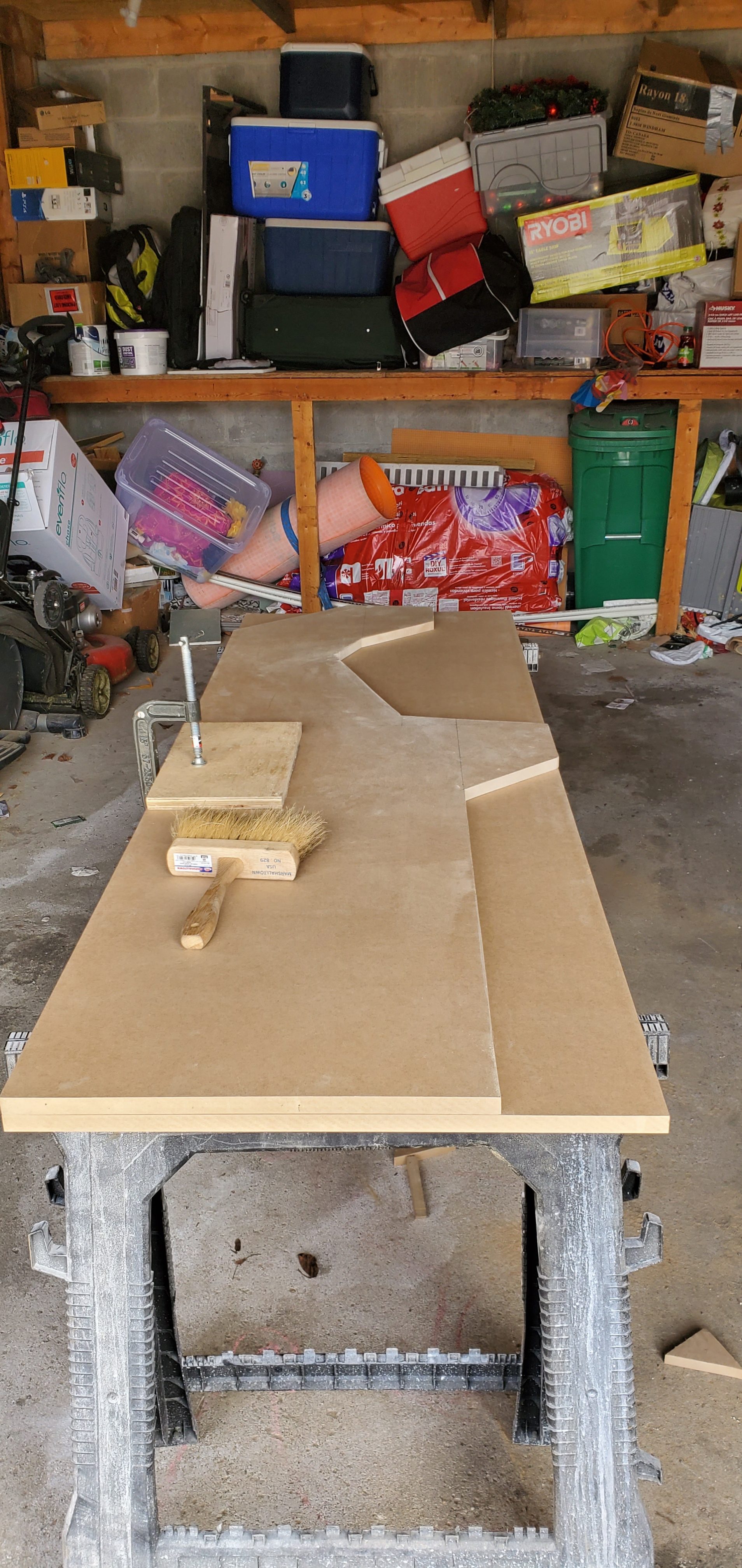
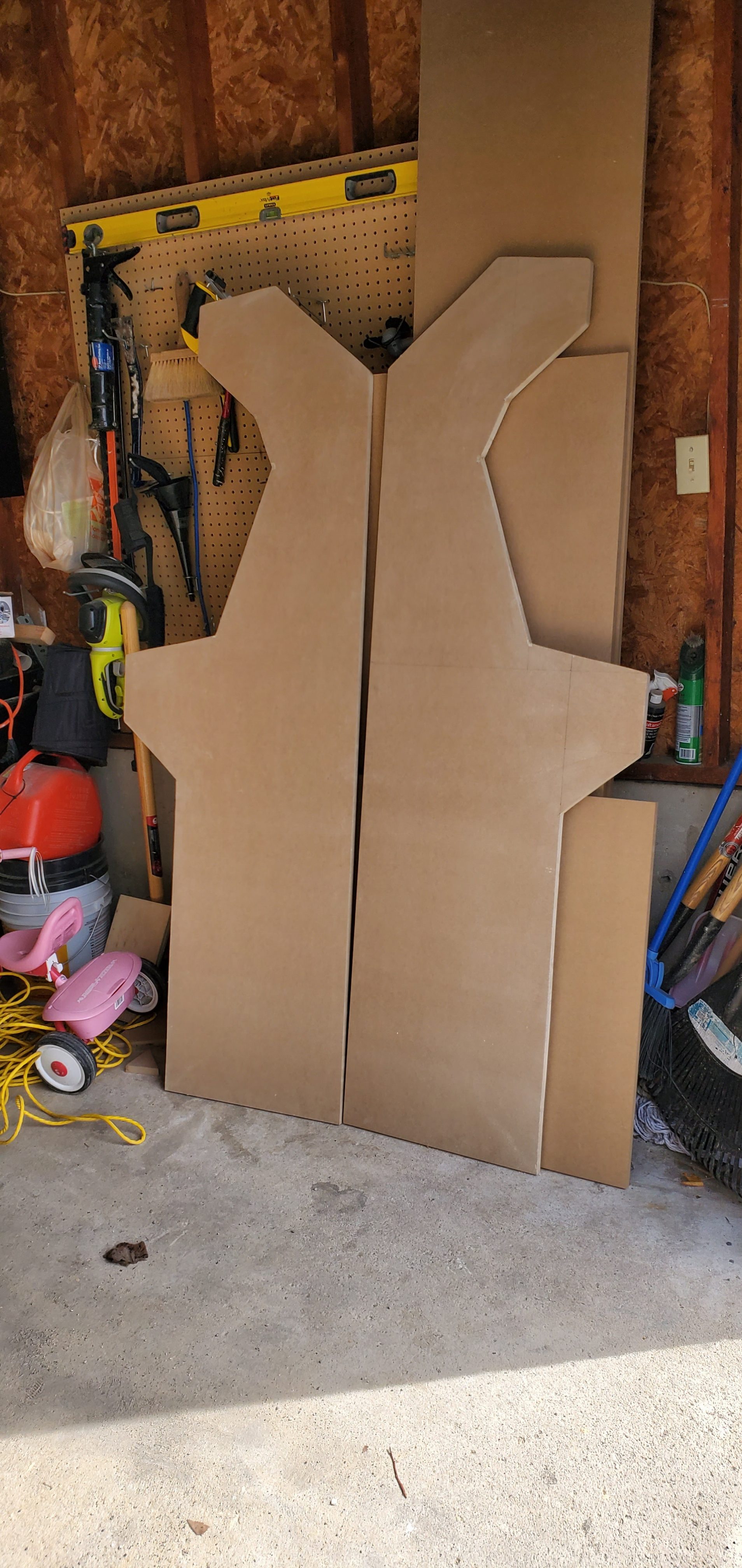
Once both sheets were cut I clamped them down and did some light sanding around the edges using a drill attachment.  I then used a sanding sponge to touch up any inside corners. I also filled in any gaps where my blade overshot the inside lines using wood-glue and sawdust. After that was complete I was left with two identical pieces.


20200316_131654


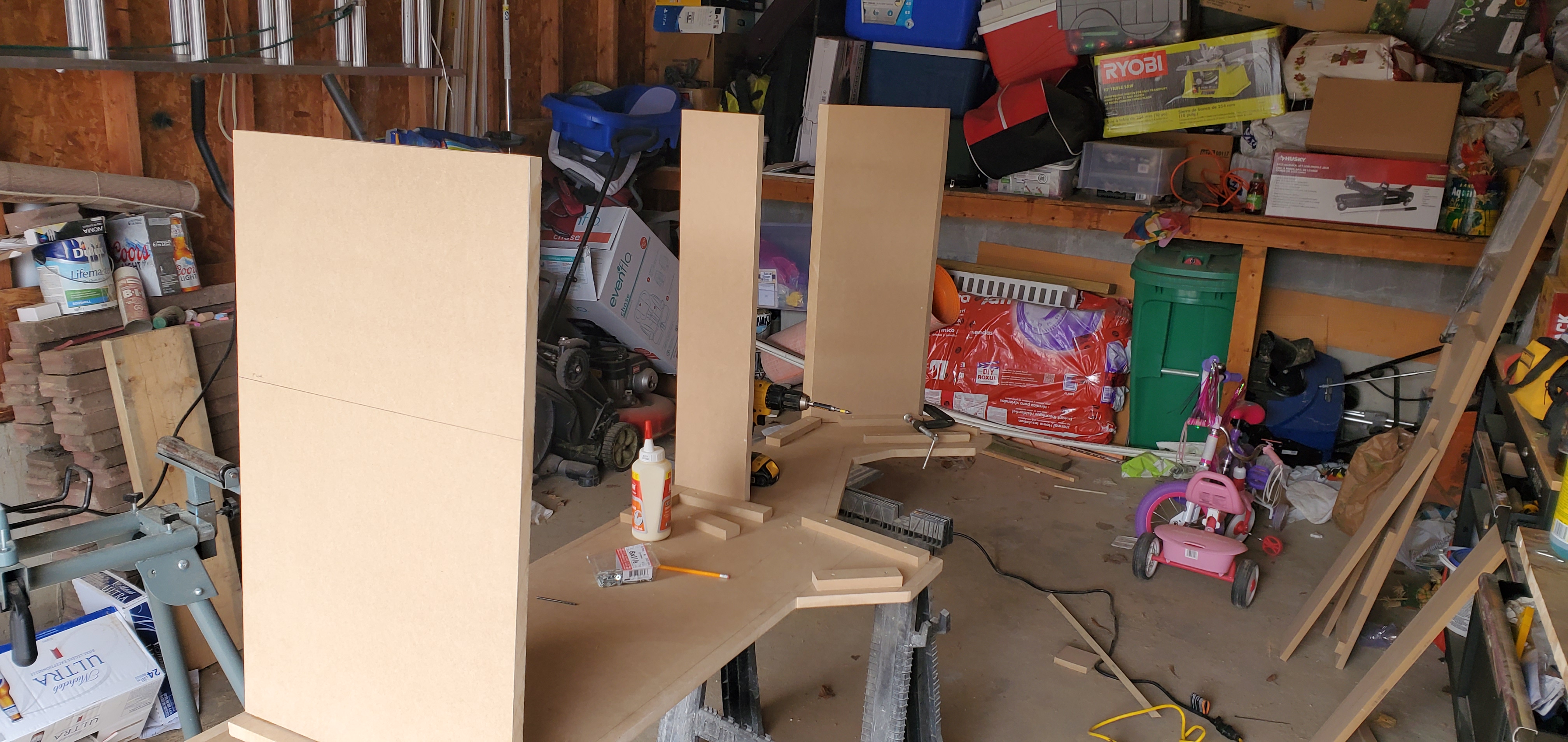
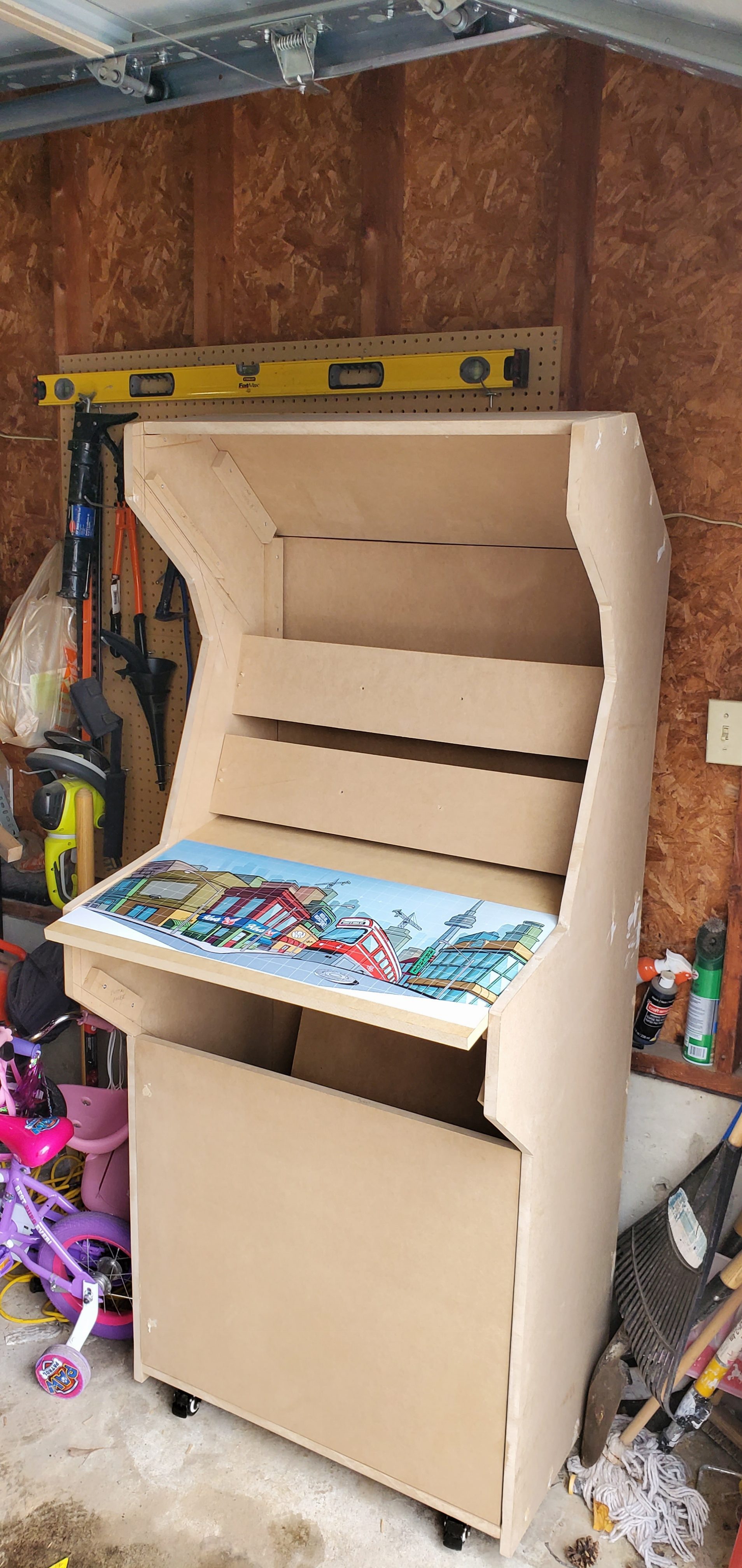
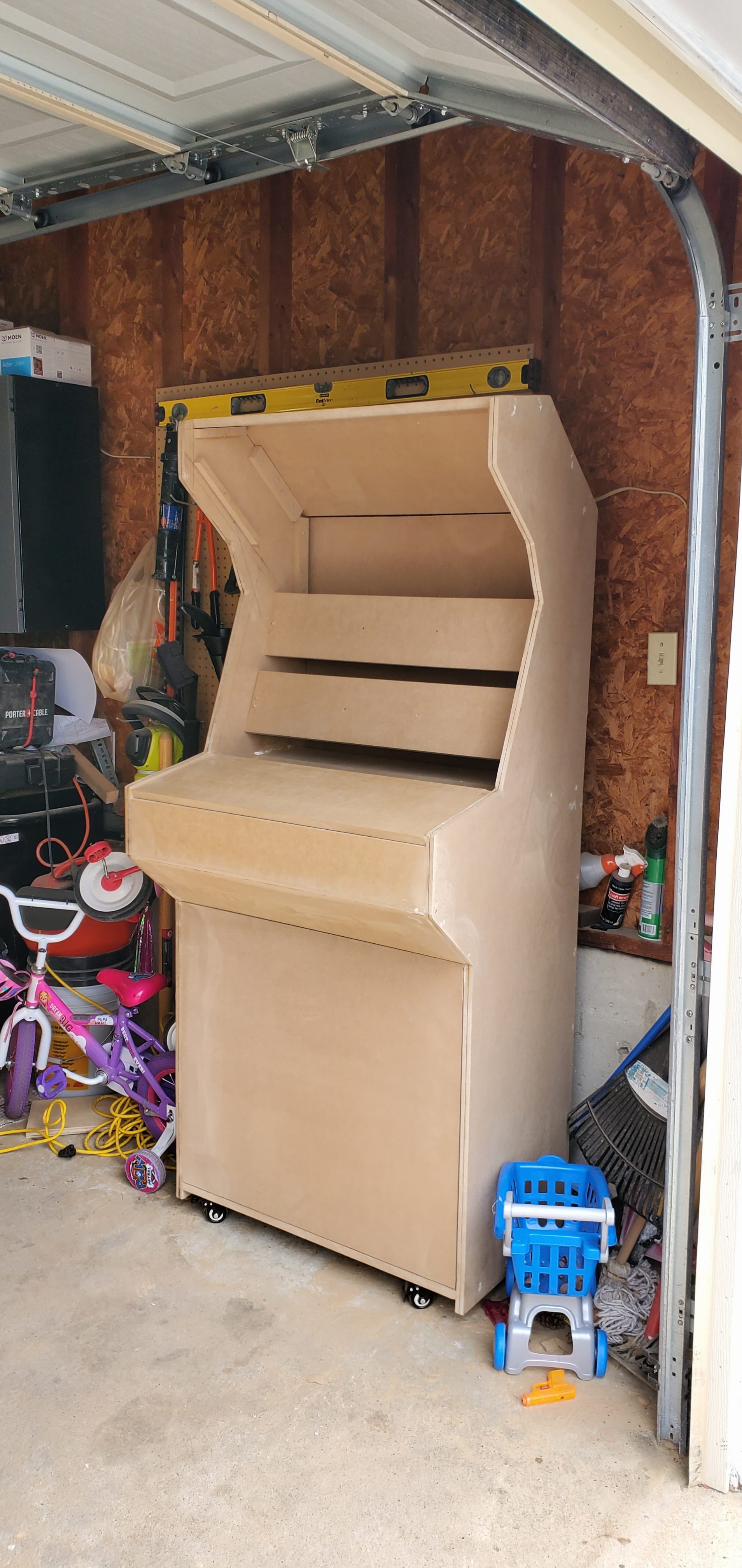
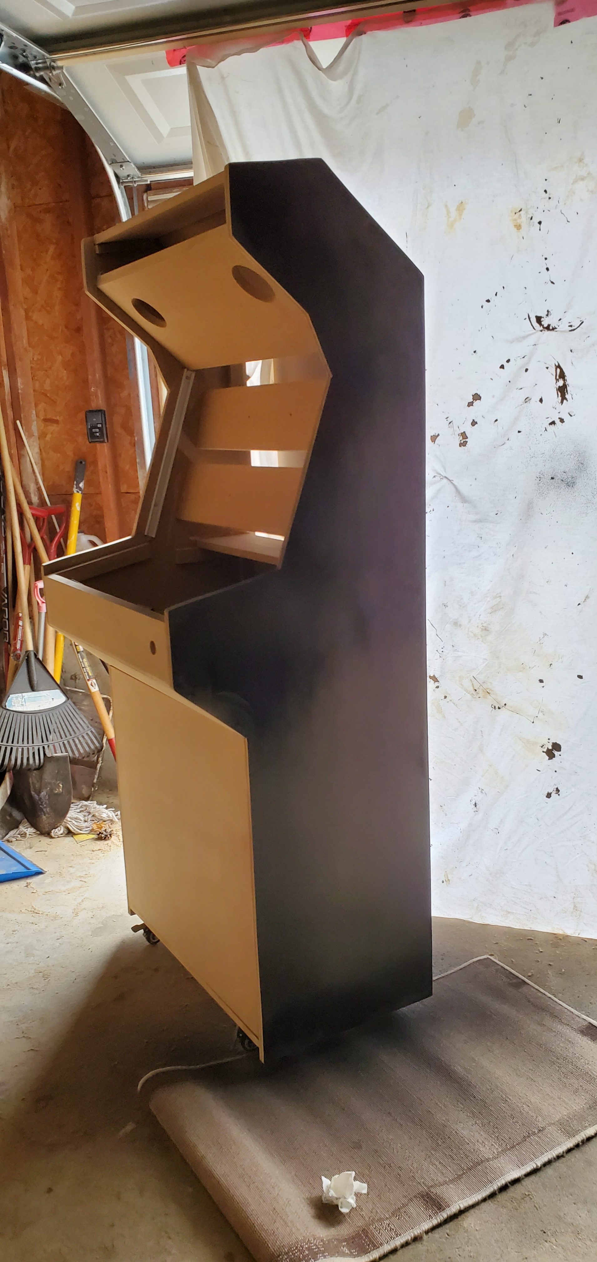
Next step I added some blocking for the outside cabinet pieces to rest against.  This was inset about 3/4″ all the way around so the cabinet doors would remain flush.  I did add extra space around the monitor going in about 1-1/2″- 2″ to give some depth around the monitor and some play-room to adjust the viewing angle of the monitor.  After the blocking was done on both pieces I installed 3 cross-members using wood-glue and 1 -1/8″ MDF screws. From here I assembled both ends together, installed some castors and set it upright.


20200320_144439(0)


20200320_09451020200320_161823

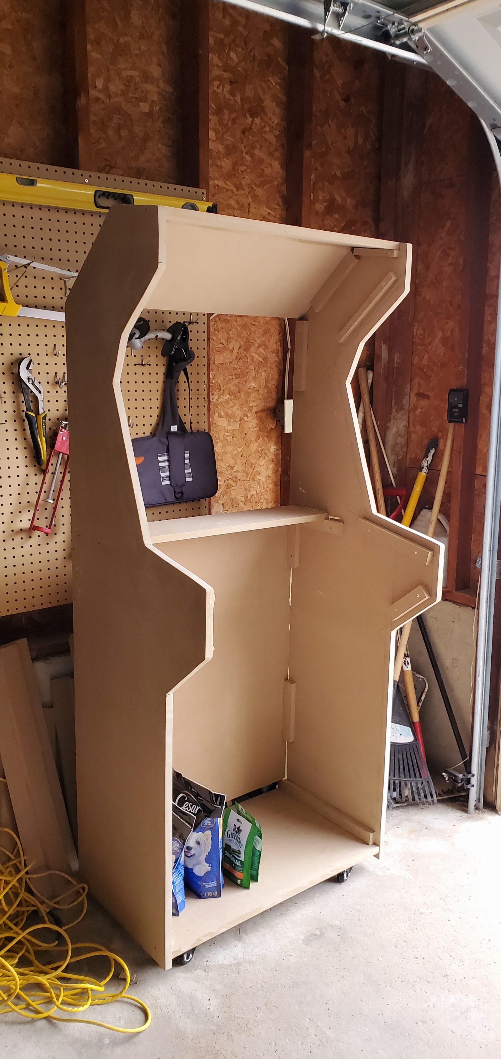
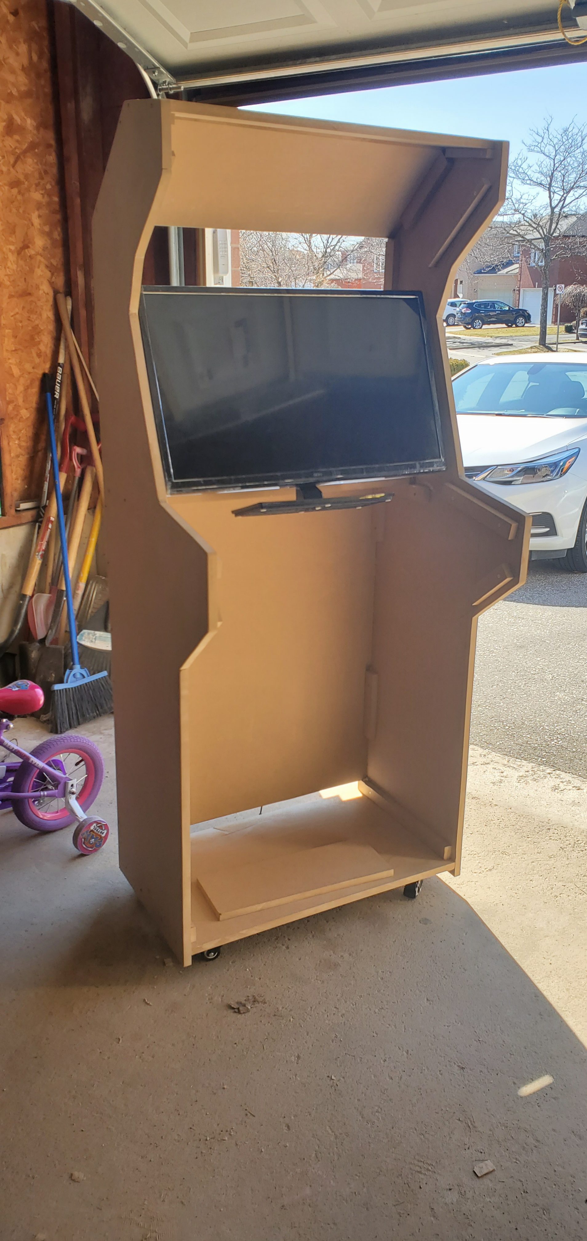
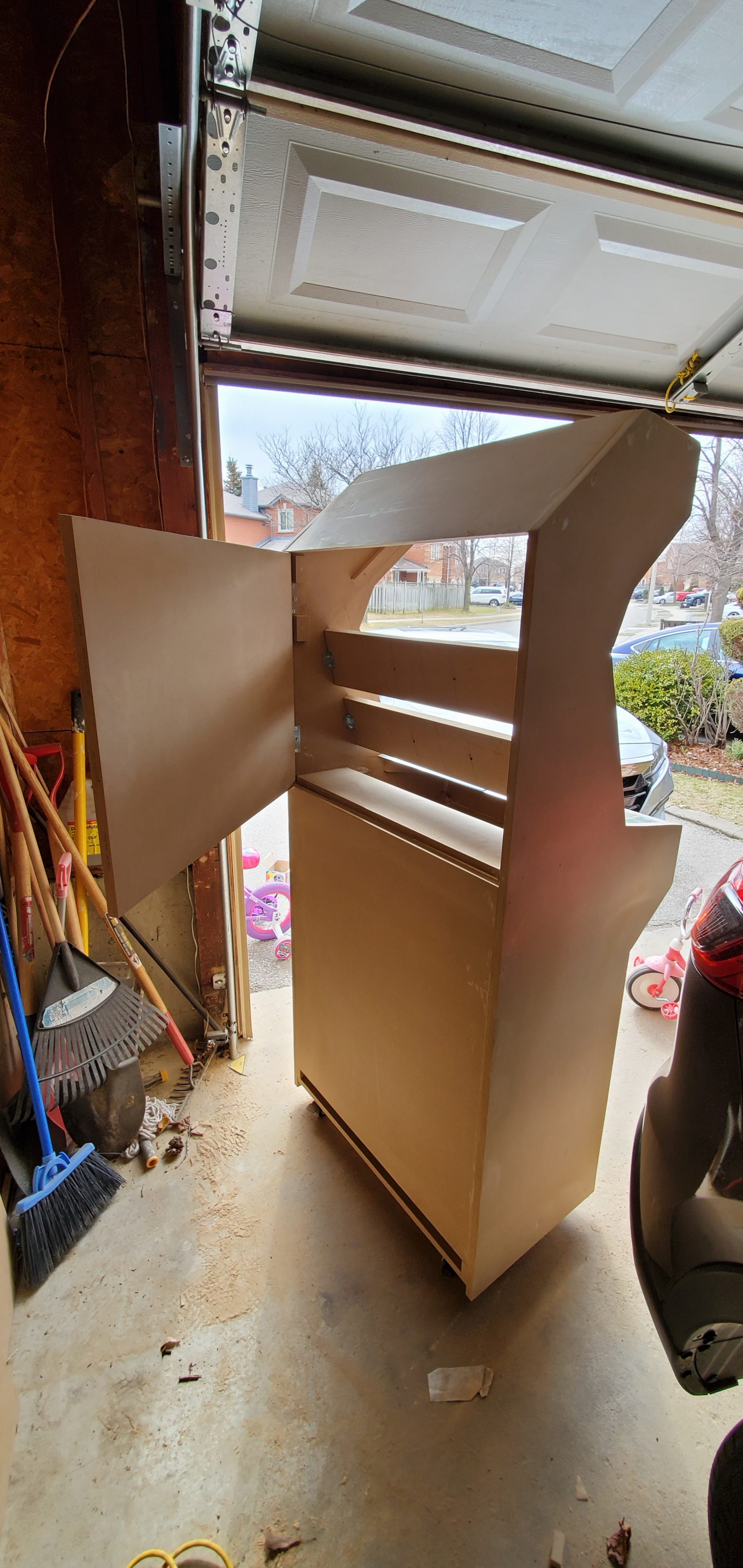
I attached the monitor to the Vesa mounts on the back. I drilled 4 holes into two separate pieces I had laying around.  This actually made it easier to line up the holes instead of using one solid piece. The cross-pieces that hold the monitor in place were attached with metal brackets allowing me to potentially upgrade or swap out this monitor if anything failed down the road. I also put a hinge on the back door for the same reasons. (The bottom was left open to allow for the computer to fan out).


20200321_12232020200324_154354


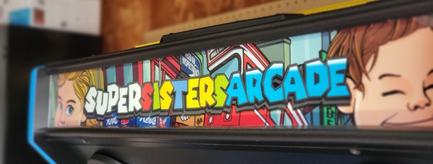
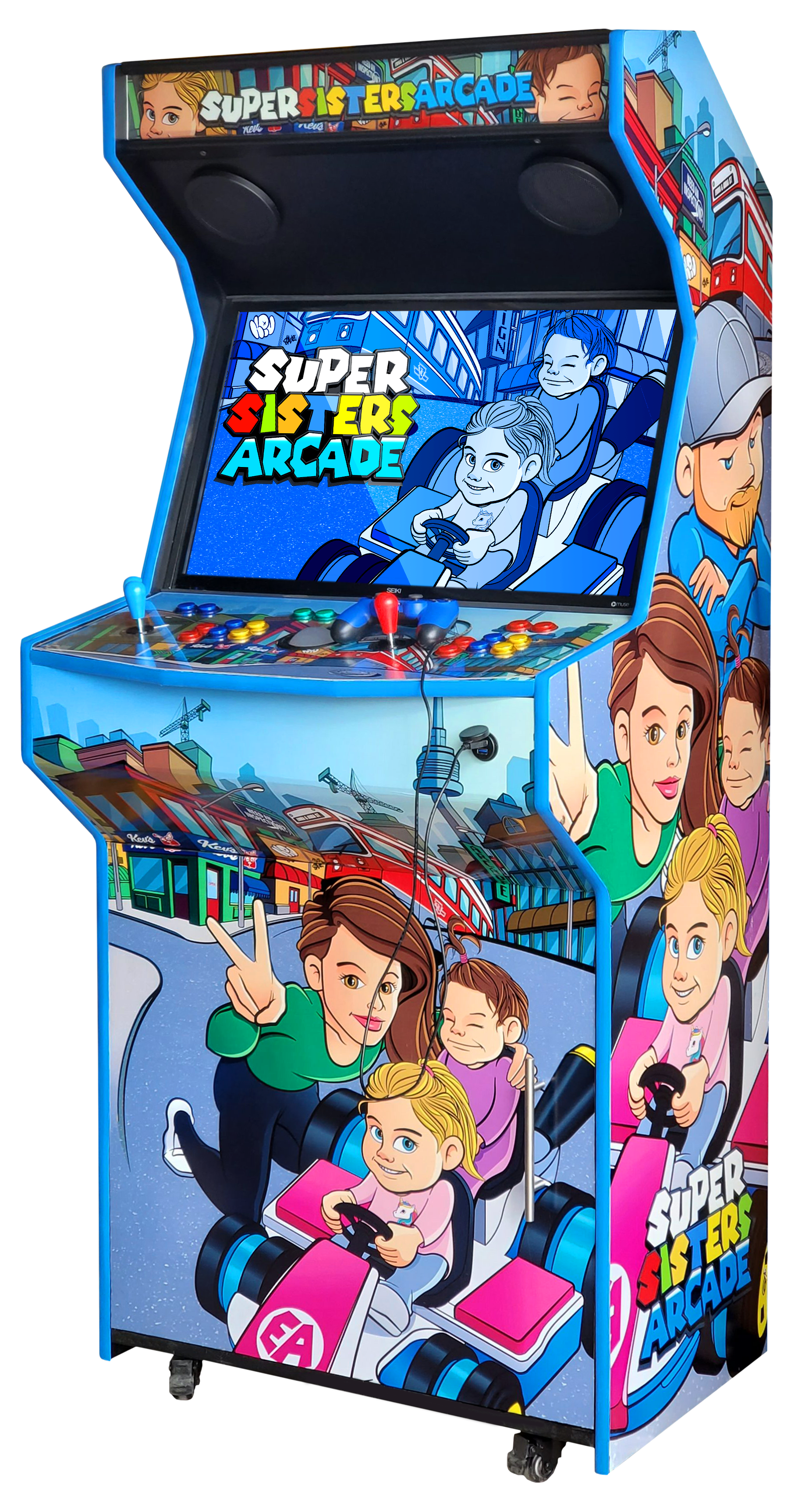
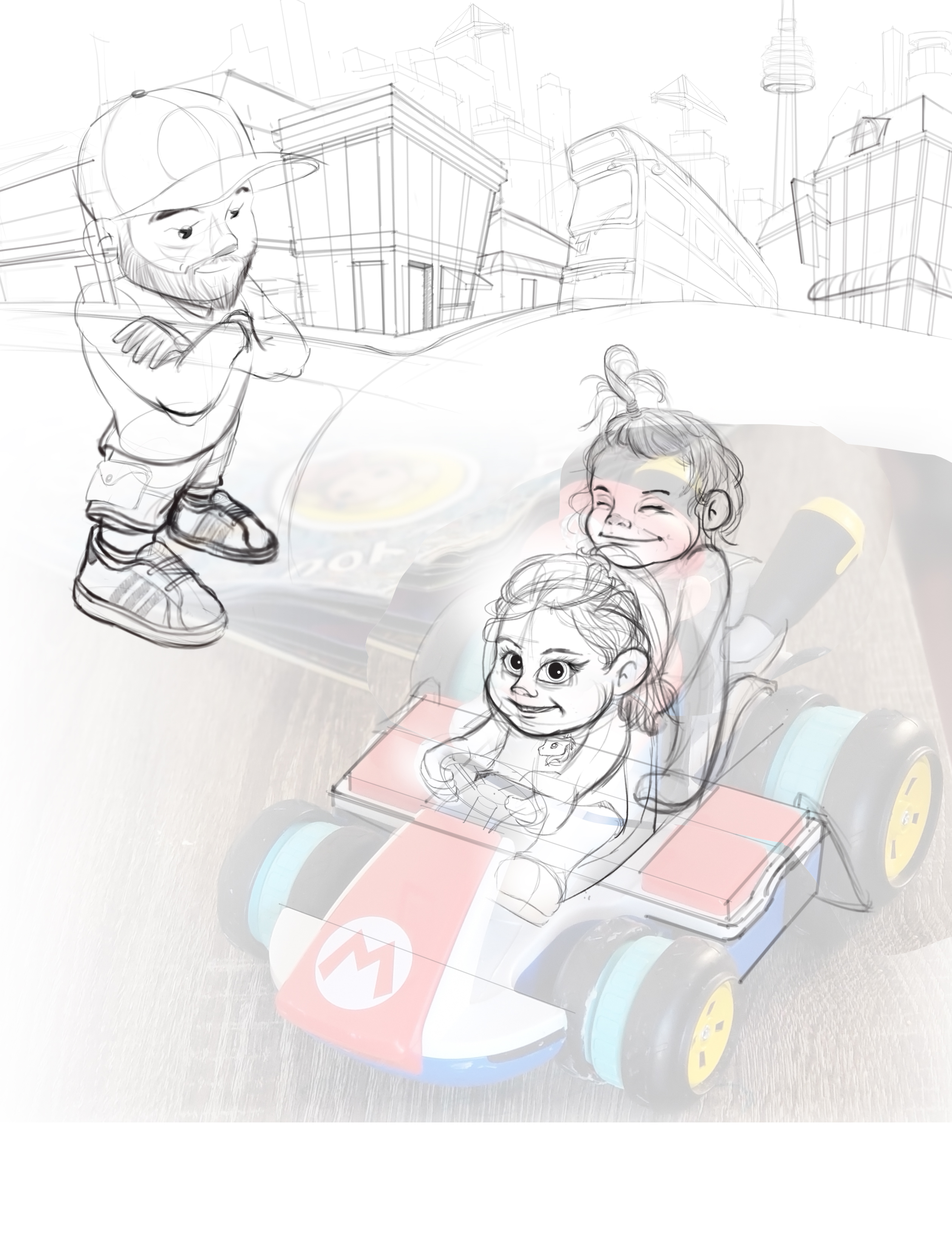
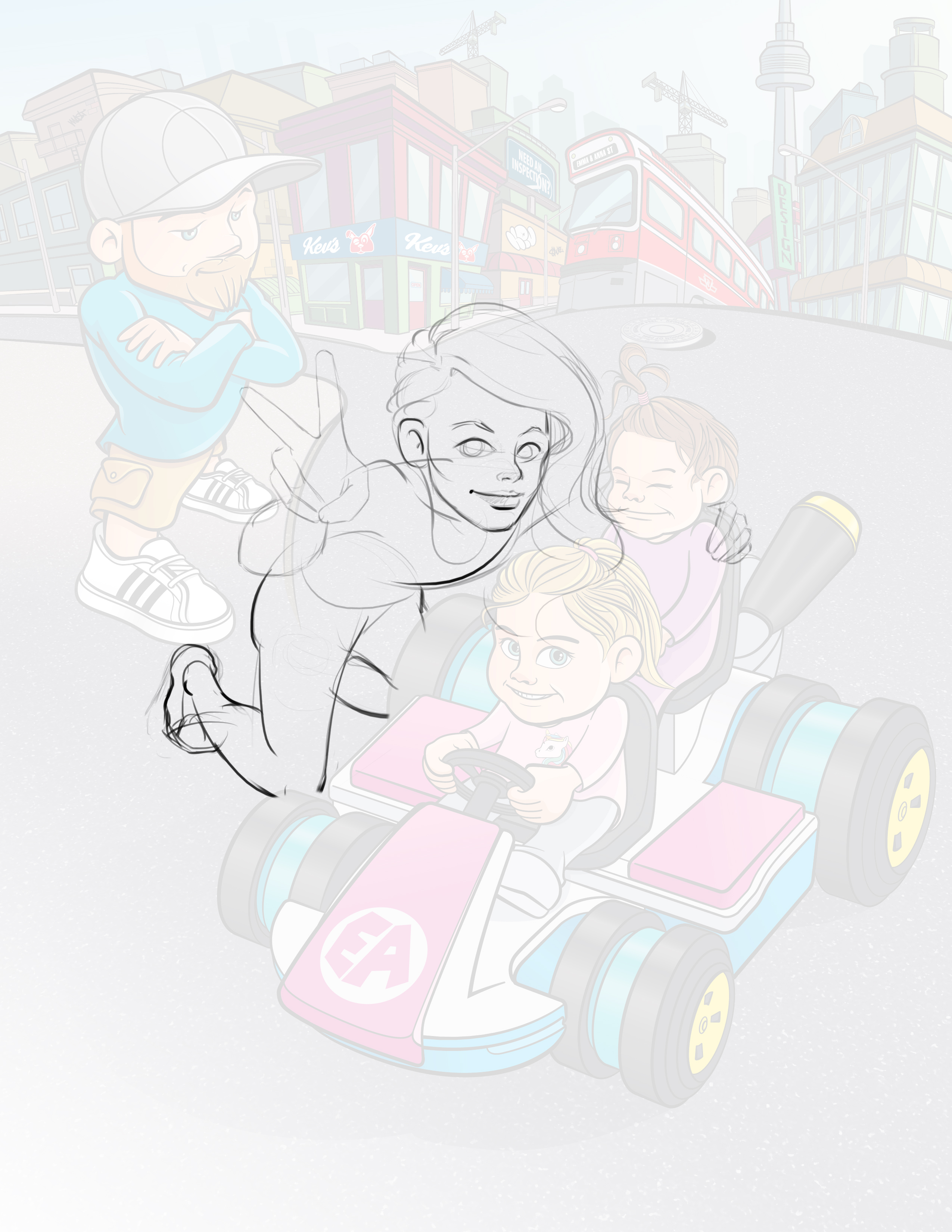
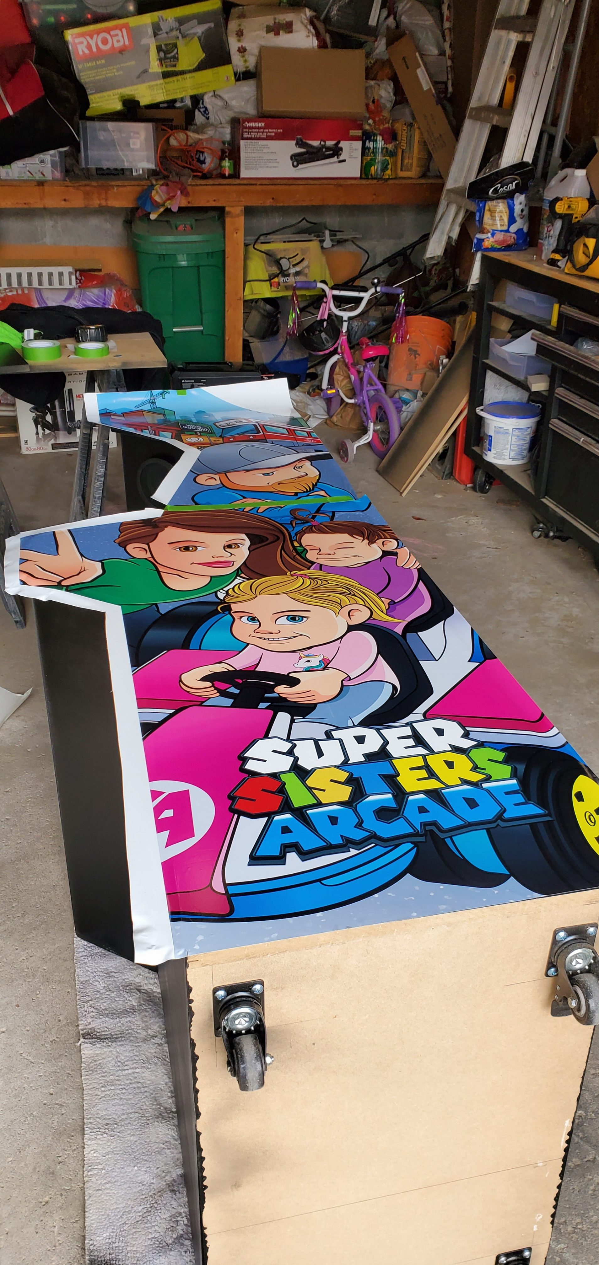
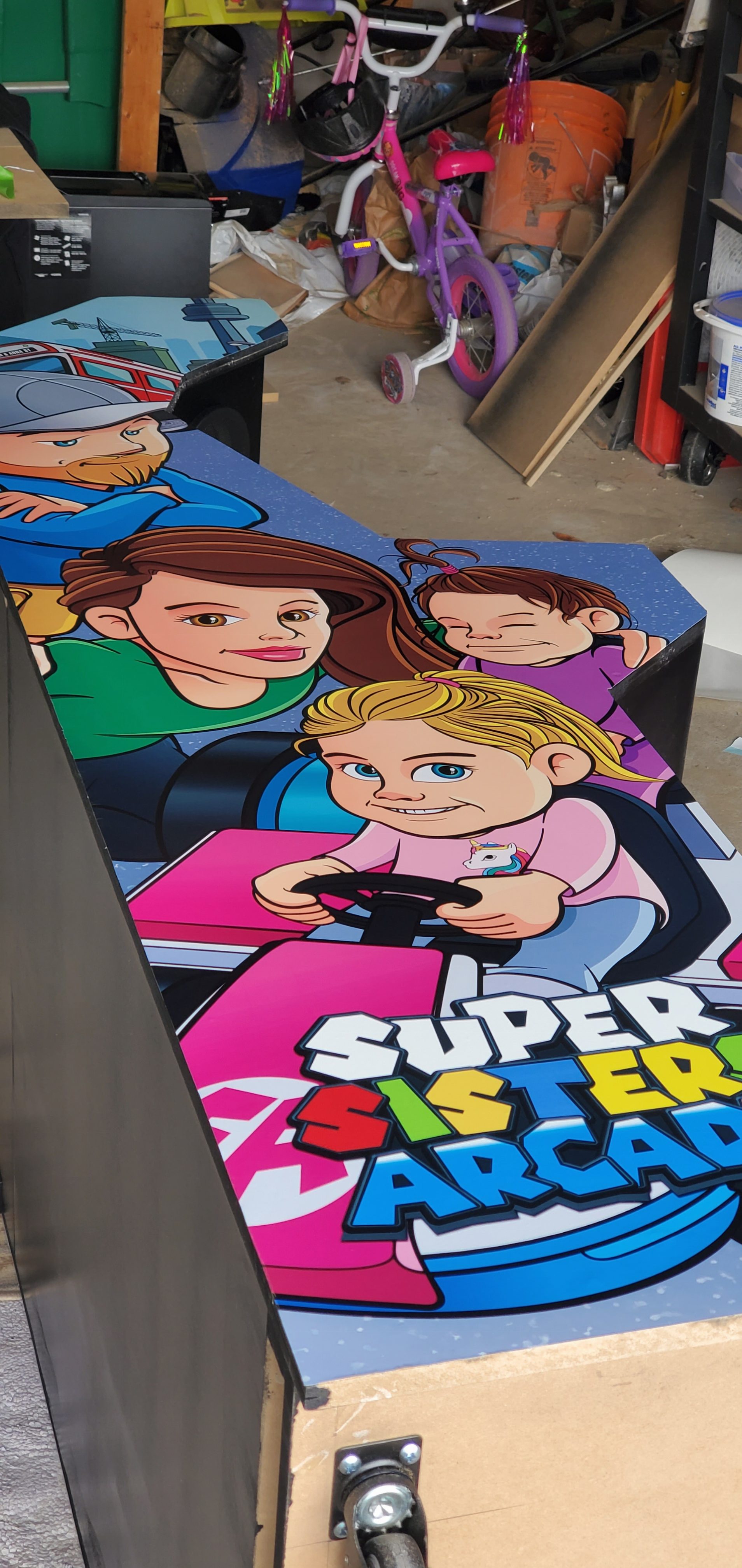
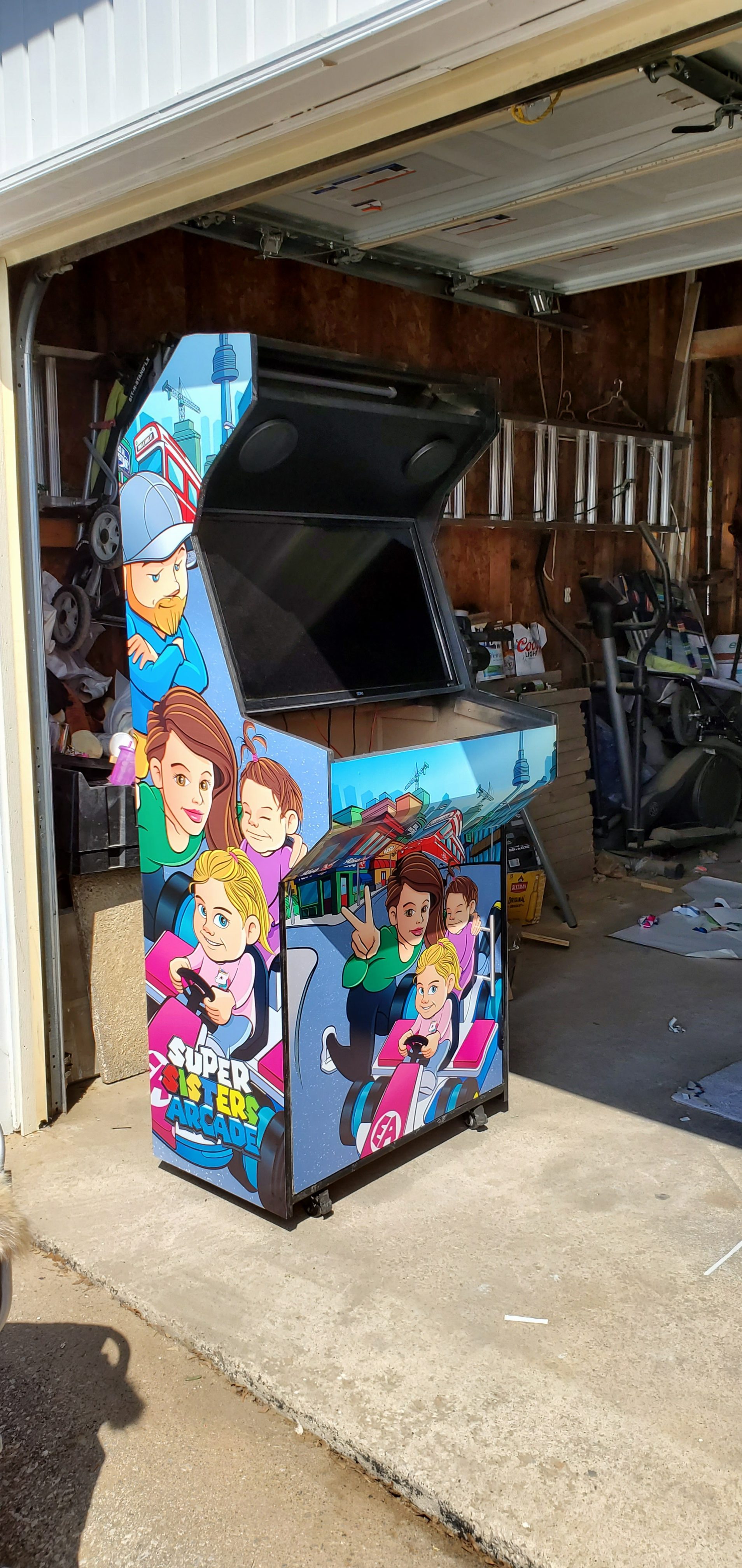
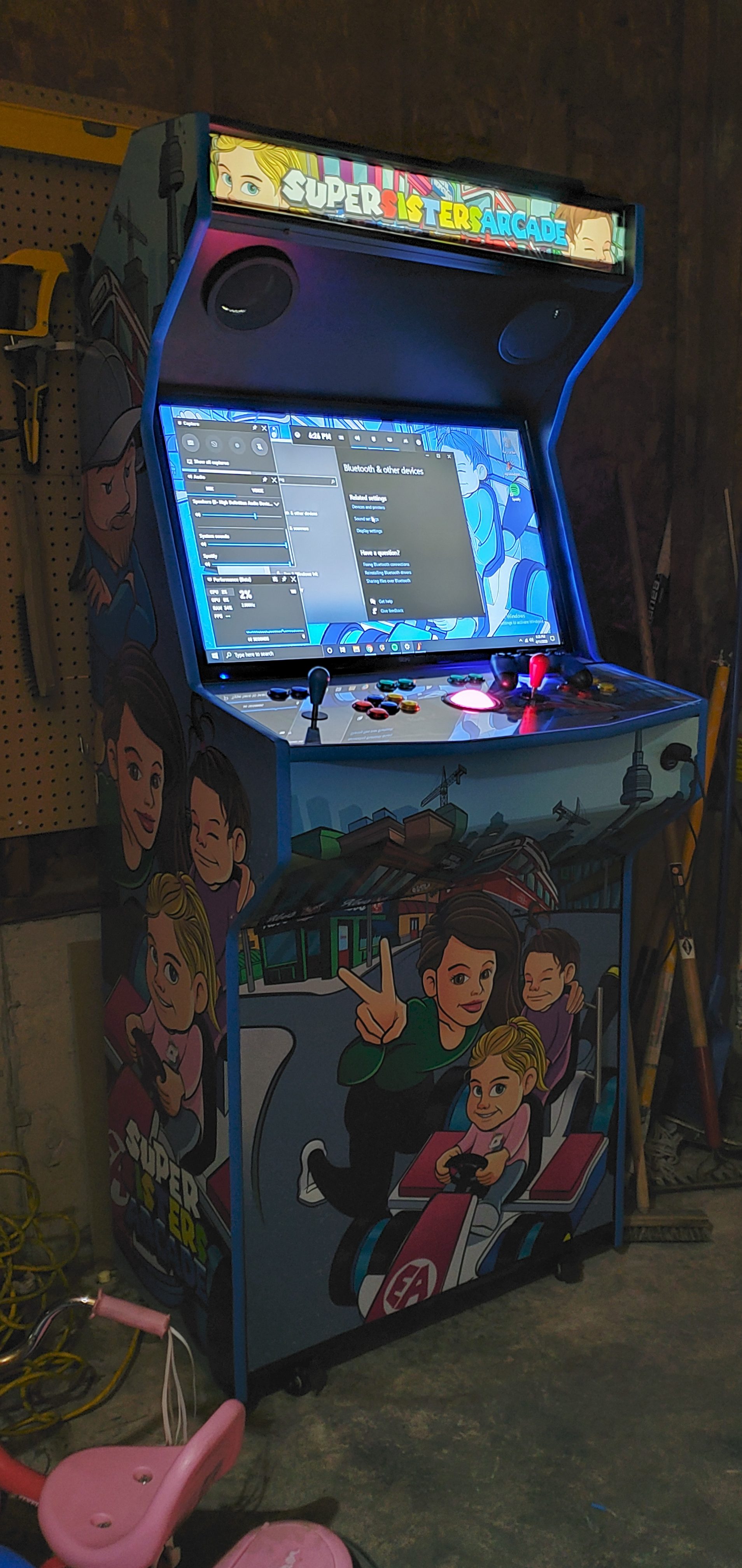
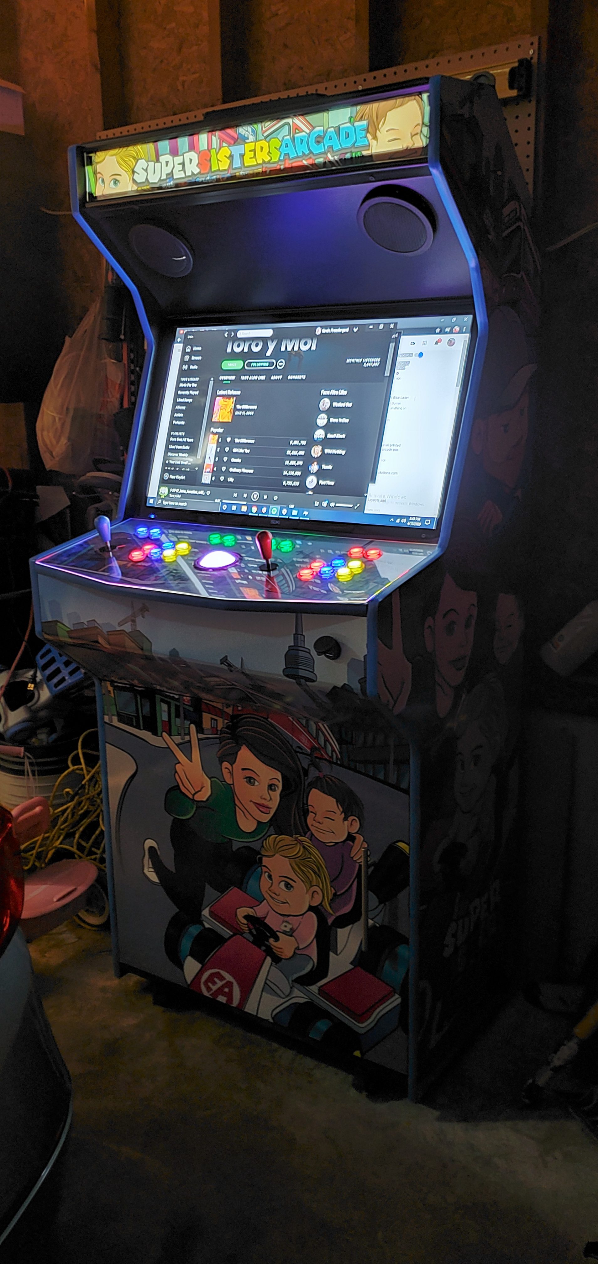
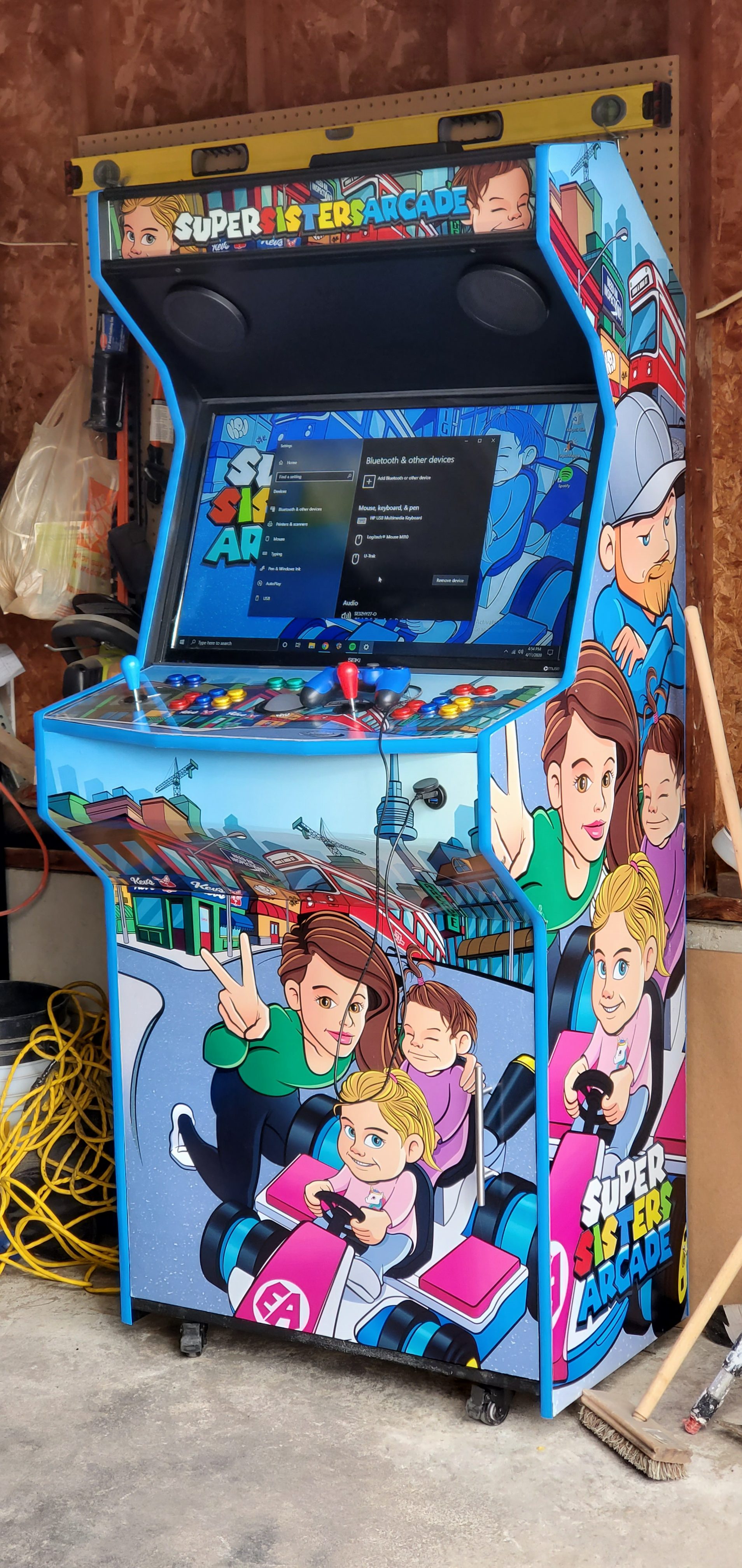
At this point I was well into designing the graphics for the arcade.  I wanted something bright, colourful and cartoonish. I thought it would be a great idea to utilize Mario’s Go-Kart and have my daughters driving around in it.  The background if you can’t tell is the CN tower and Toronto’s infamous streetcar to represent my life journey. I also liked the Mario typography used for their past games and thought it would be fun to include that as well. I used all these ideas as inspiration to do the illustrations myself!


Supersisters03RESUMELINES_COL_EMMAANNA_14MERGEDFIXED

Supersisters


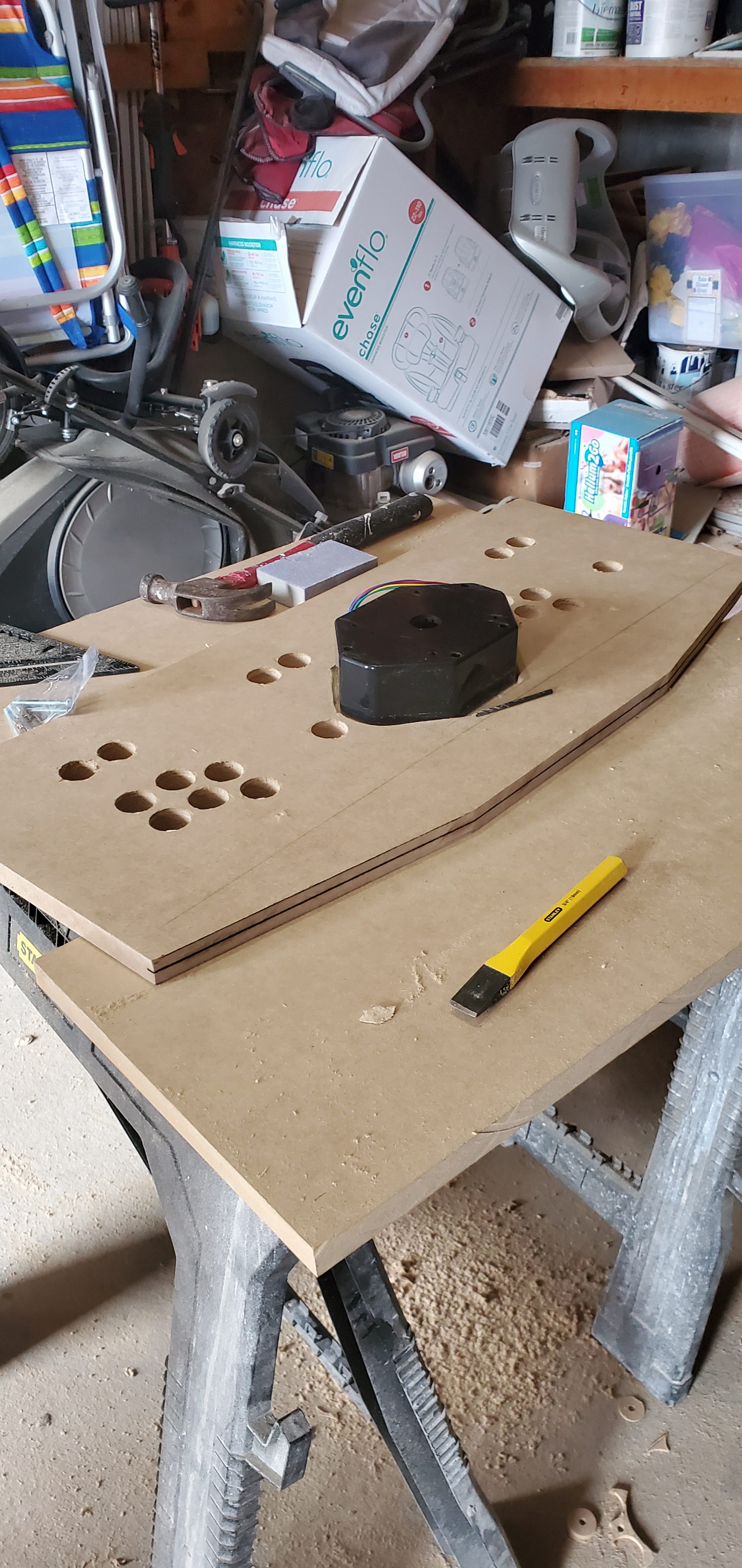
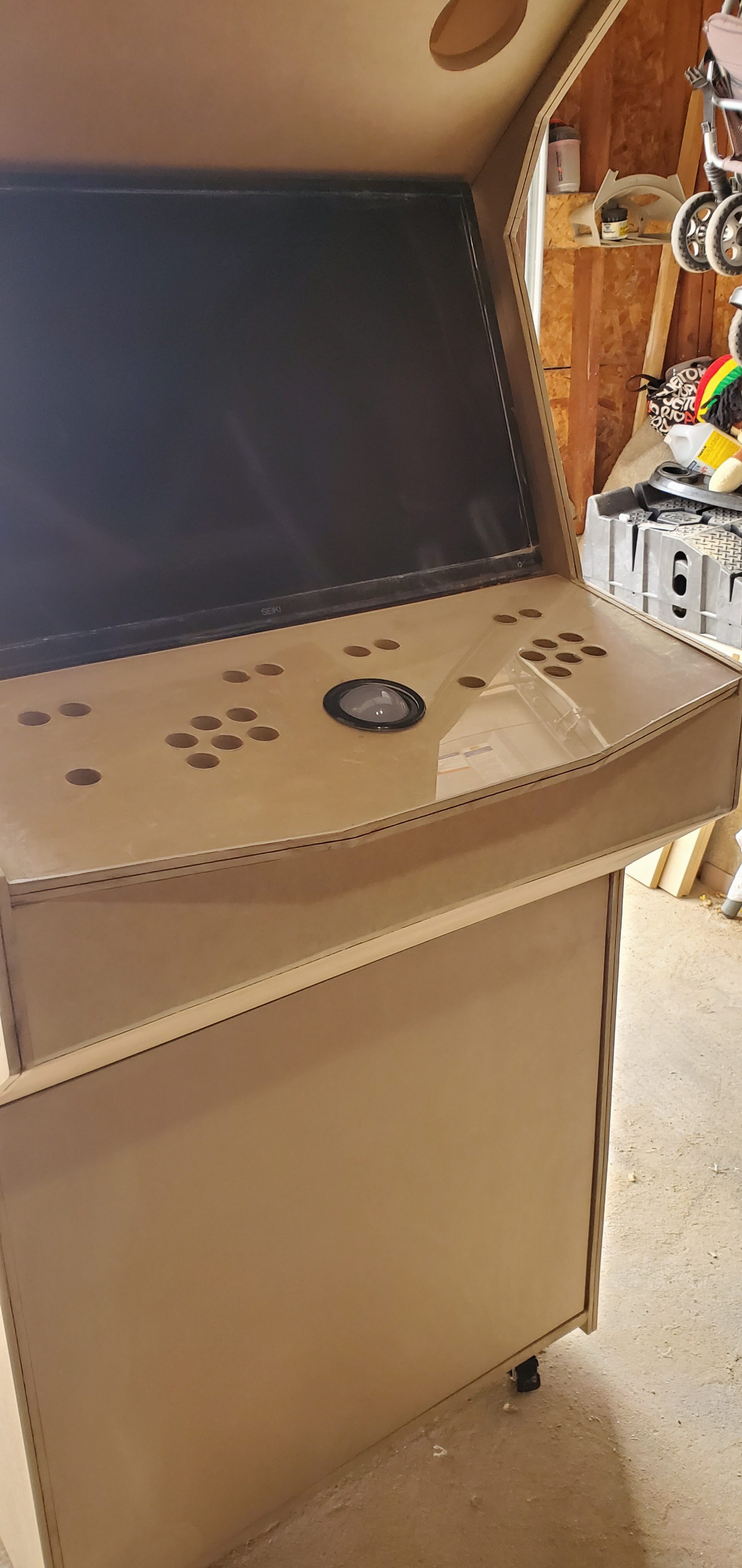
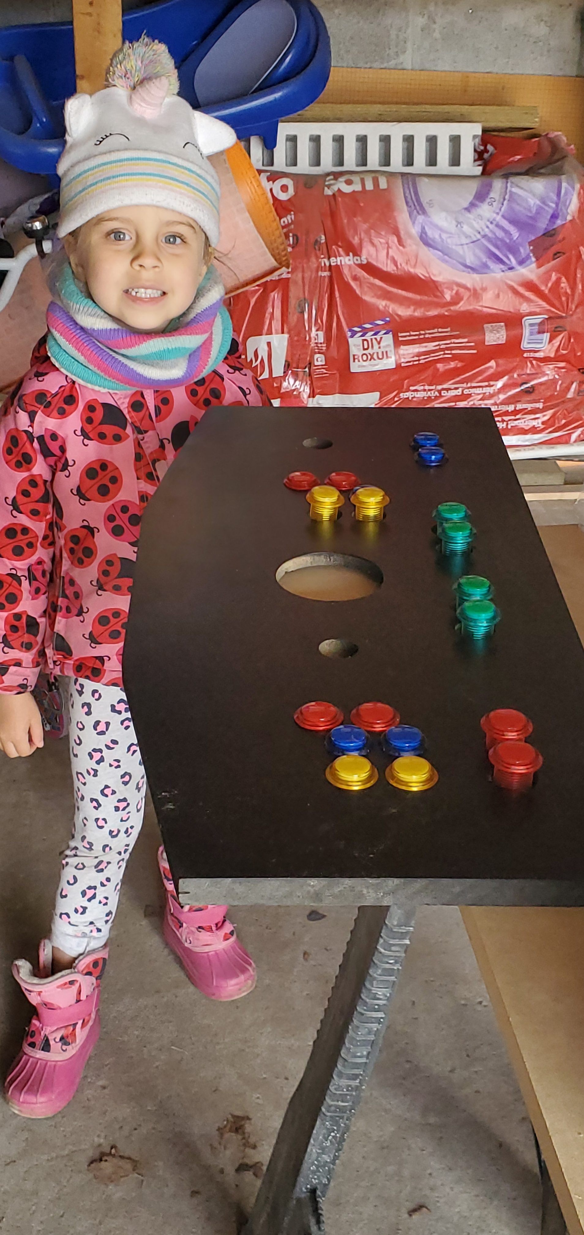
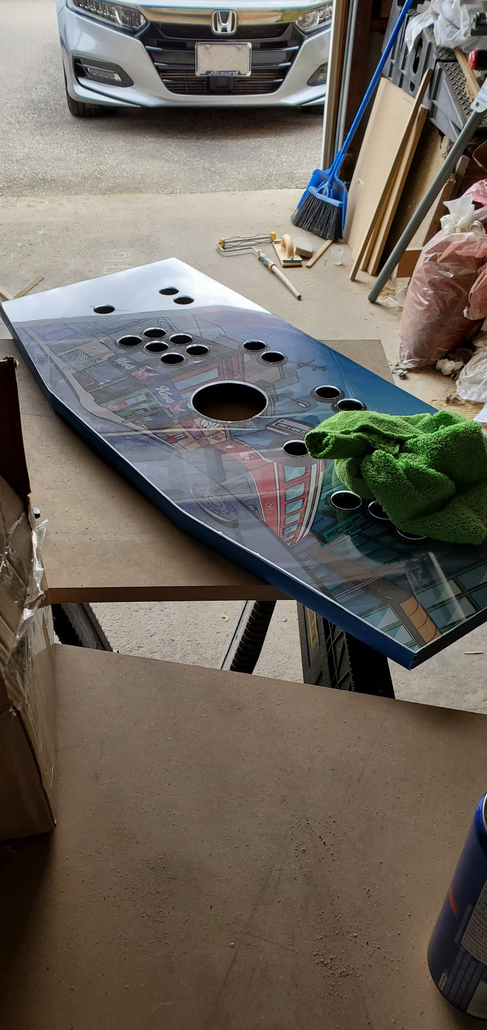
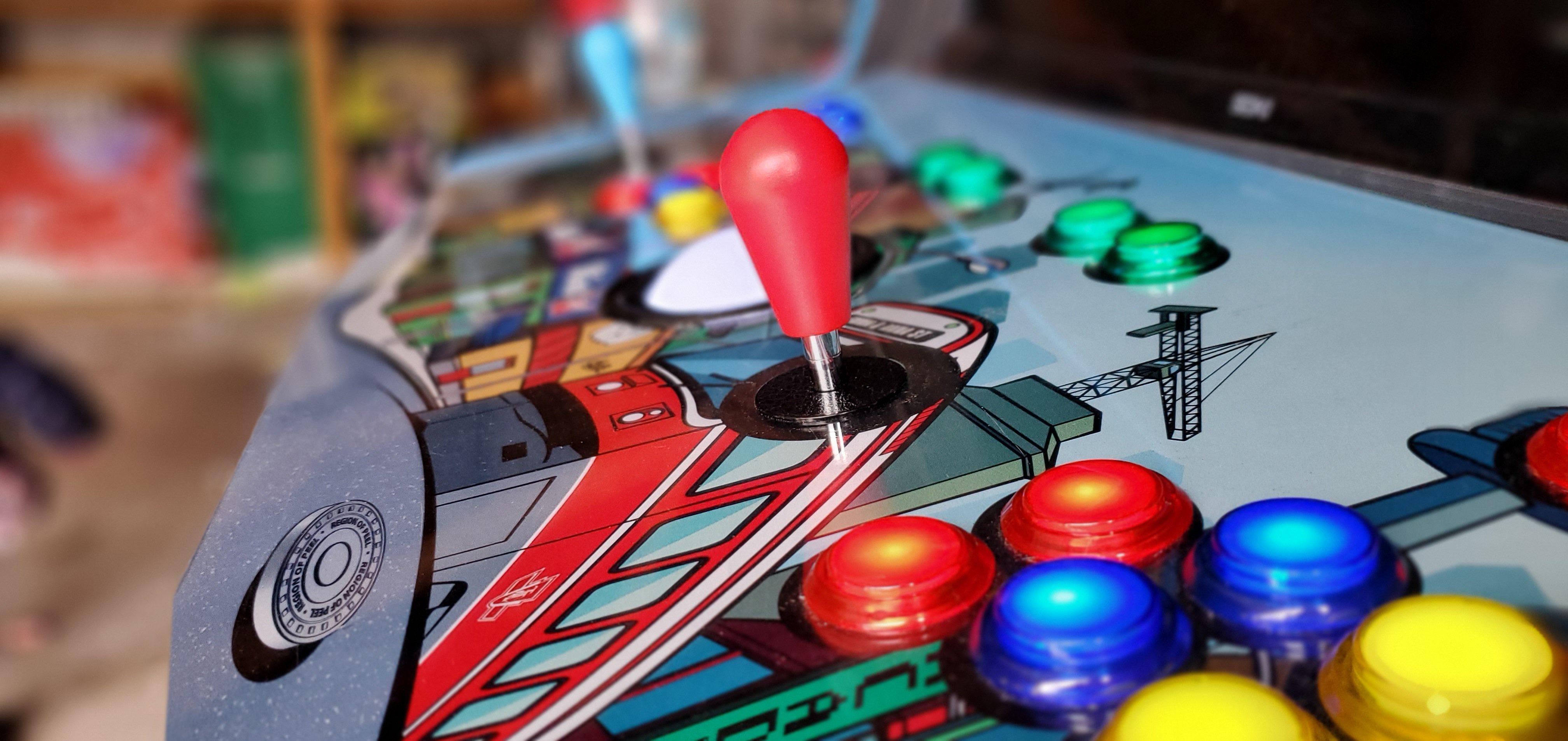
I laid down a piece of MDF to test out the graphics for the control panel.  I printed crosshairs to mark where each hole needed to be drilled out.  I chose to go with a standard Japanese-style layout borrowed from stagecoin.com

20200323_155546


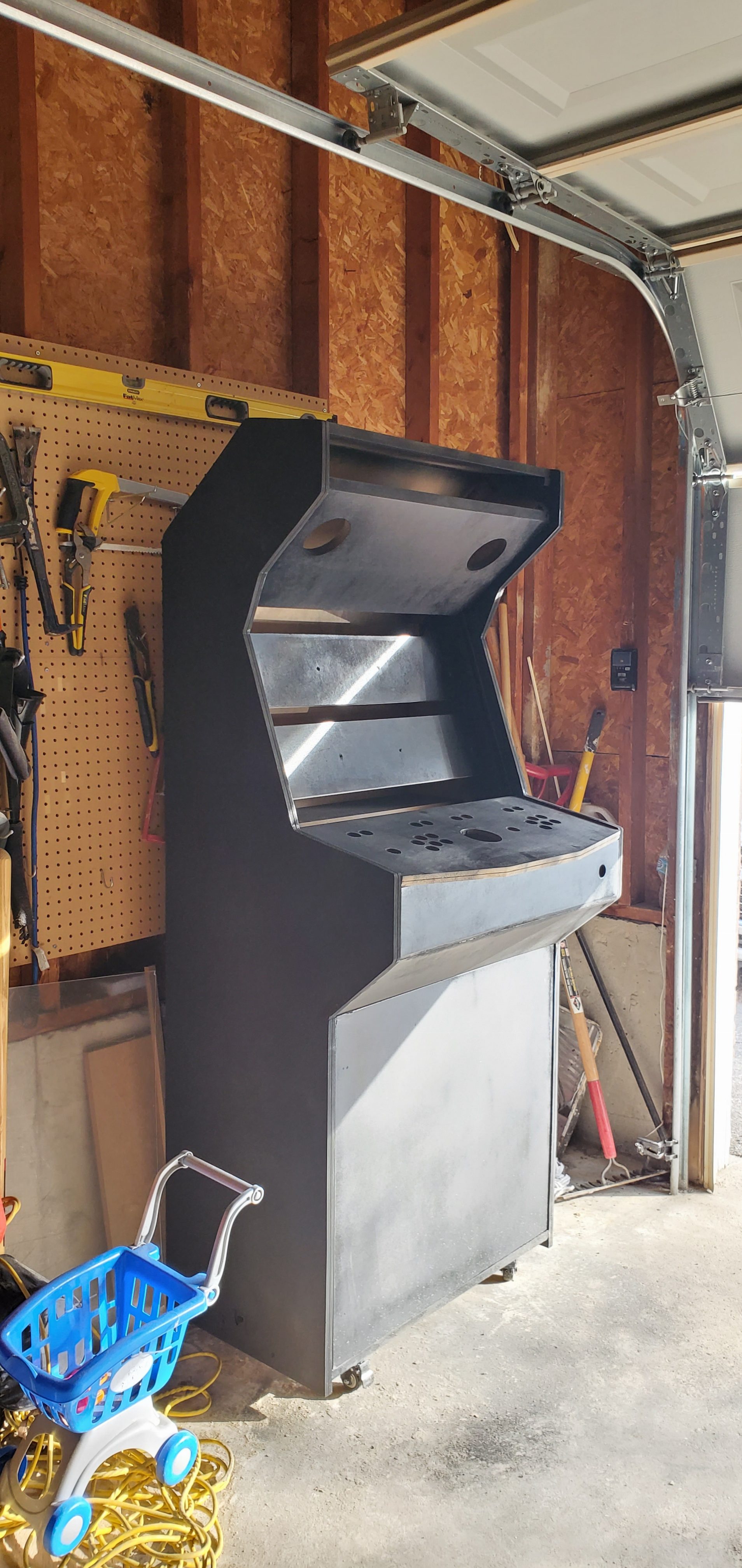
While I was waiting on the router bits – I cut the slots for the T-molding after the cabinet was already upright. It was an easy fix to just lay the cabinet on it’s side and work on it in that position. I cut a 1/16″ slot all the way around the edge using a 3-wing slot cutter attached to an arbor fitted for the router I was using. I’d recommend going slow and making sure your cuts are deep enough as I had to go back and cut certain spots a little deeper.


I reinstalled the monitor to get the final positioning for the outside pieces before wood-gluing and screwing it all together.

20200326_11371420200327_125035


I went back to the control panel and overlaid a sheet of acrylic on top of the graphic and MDF before drilling 1/8″ holes to mark where the buttons and joysticks would sit. I removed the pieces from each other and drilled 1 – 1/8″ holes for the buttons and joystick using a wood paddle-bit.  I used a step-bit to drill into the sheet of acrylic as it’s much more delicate of a material to work with. I used a 3″ Hole saw to drill for the trackball and hoped for the best! Luckily it turned out okay.  I’d recommend using a 3 -1/8″ bit as I needed to modify the top trim ring slightly to make it fit.


20200327_15430720200327_162649

I flipped over the control panel and dug out a spot for the trackball to sit using a paddle-bit and a chisel.  This section would be hidden in the final product so I wasn’t too worried about clean edges. I placed the acrylic on top and fitted the trim piece in. I drilled 4″ speakers holes with a hole saw and another hole in the front for a USB extender. So far so good!

20200328_11404420200328_122226


PRIMED AND PAINTED

PUTTING ON A COAT BUD


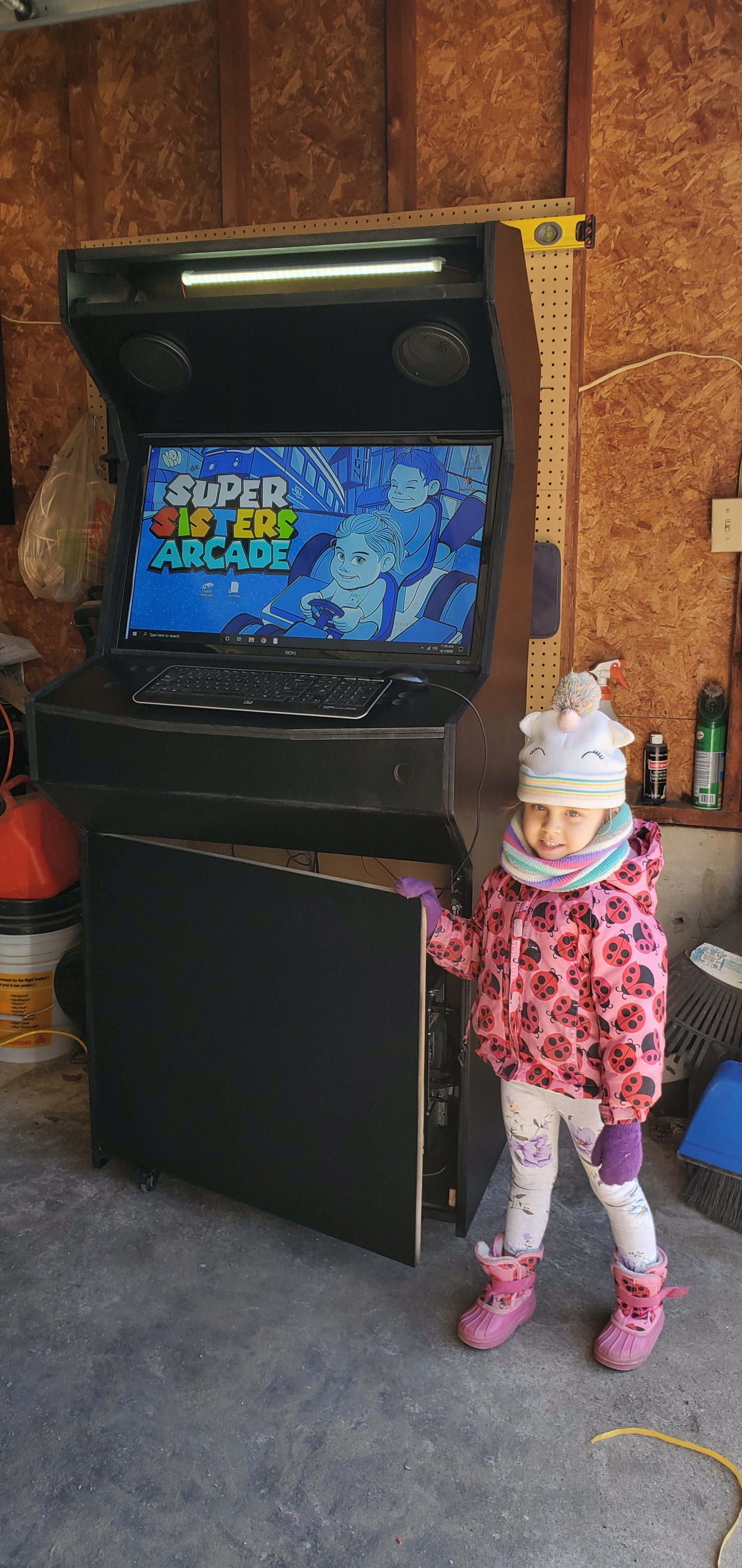
It was time to paint the cabinet. I used an oil based paint and primer in-one and went with a black satin finish. The only part that was to be left visible after the vinyl graphic installation would be the speakers and the back but this part was necessary to help allow the vinyl to adhere to the MDF properly.

20200329_12354020200329_174624


After a couple coats it was looking pretty good. I installed the marquee lighting and attached the monitor to its final resting spot. The speakers were also wired up and attached to an amplifier placed inside the cabinet.

20200401_115606


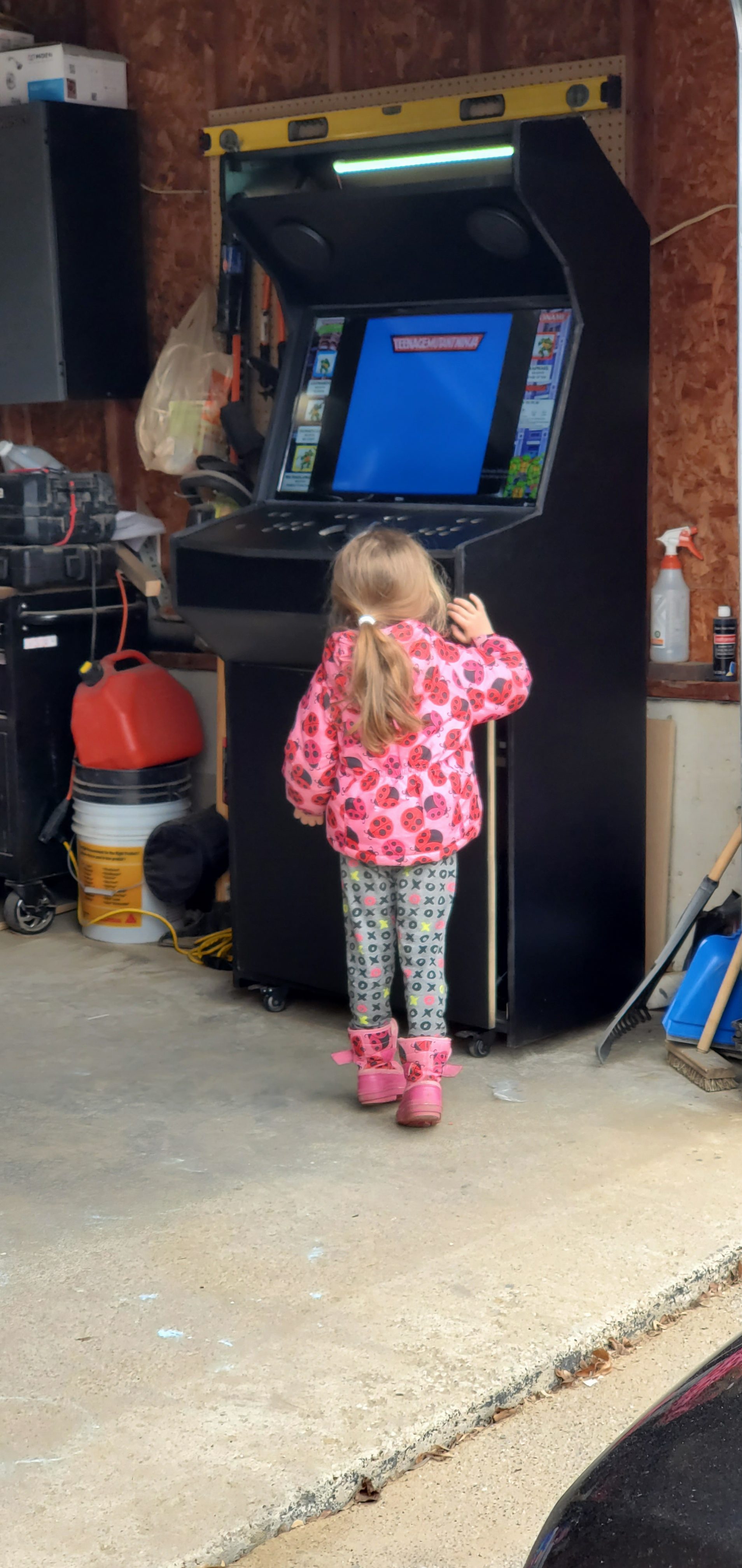
My wife and daughter testing out some TMNT

20200403_15101920200403_151553


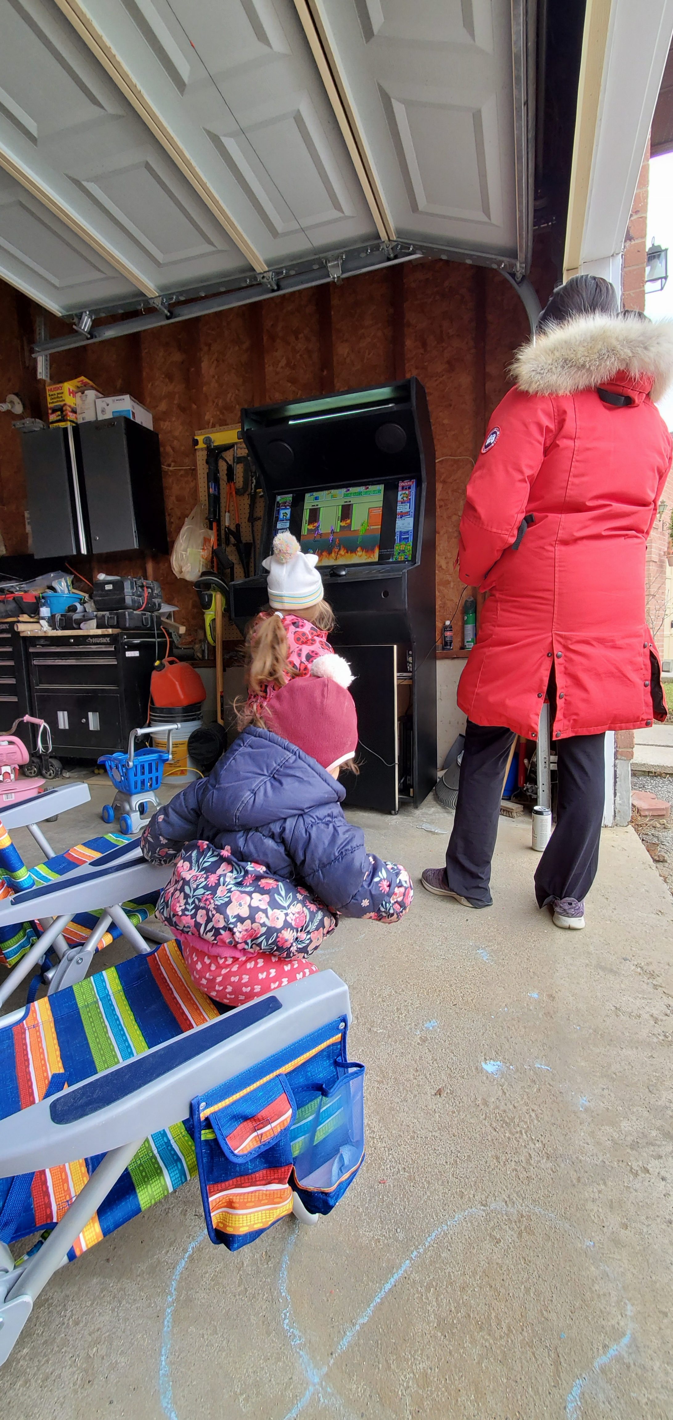
.. and some some Street Fighter IV

VINYL

GRAM-MO-MO-PHONE

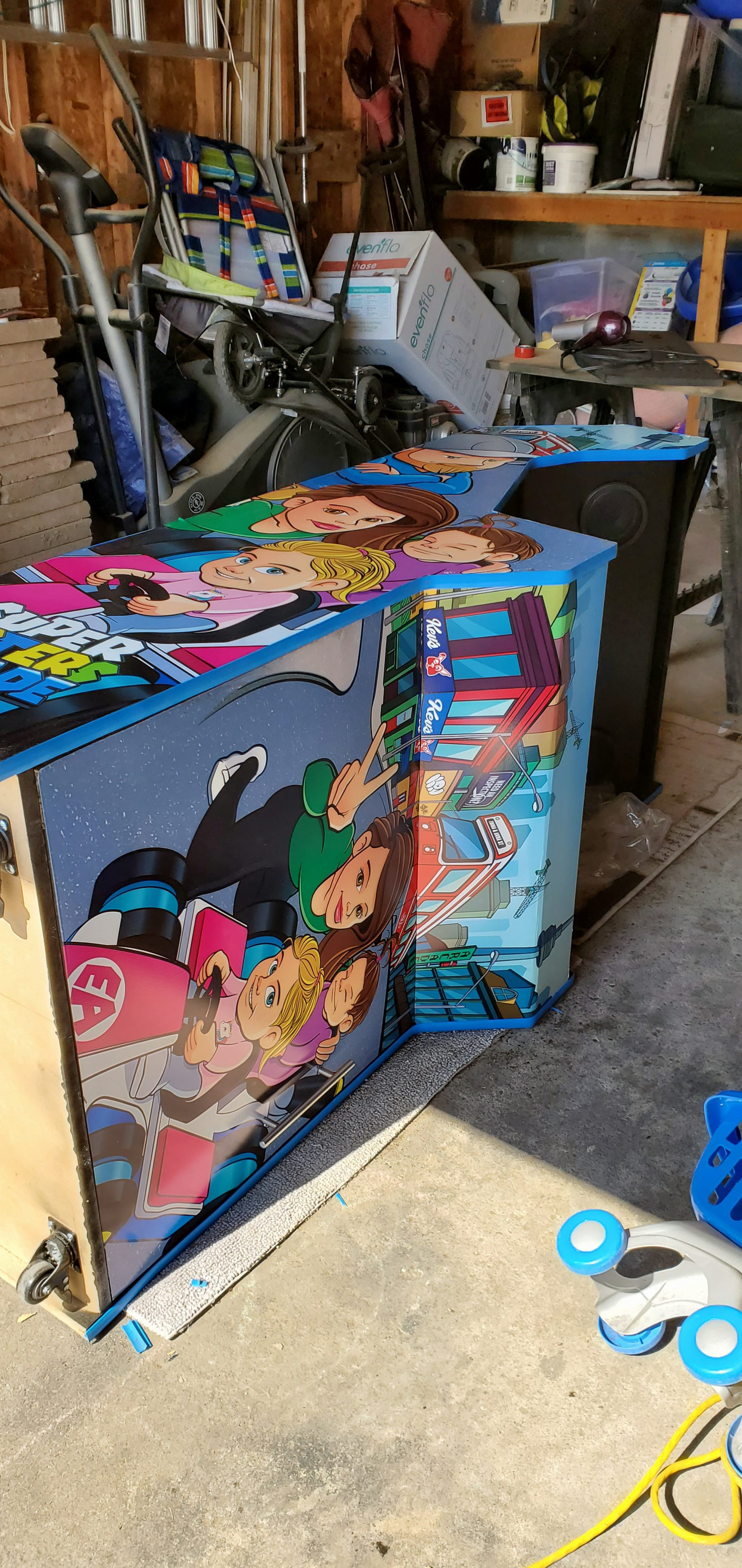
The vinyl graphics took some time to arrive but this allowed for the paint to have a good amount of time to dry. My wife assisted me with adhering the vinyl and I would recommend anyone not familiar with laying down vinyl to get an extra pair of hands for this process, especially with the larger sheets.  I made sure the graphic had about an 1″ or more bleed all the way around the cabinet so any minor shifting of the paper wouldn’t show.  I taped the paper down in place using painter’s tape on the ends and in the center. I worked from the center, peeling the backing off and slowly dropping the sheet down evenly, applying pressure with vinyl applicator and until the vinyl was fully applied and all air bubbles were removed. We then did the same for the top, working from the center and going up towards the marquee.


20200408_111322


Cut along the vinyl with a blade to produce sharp edges.

20200408_115555


Repeated the process for the remaining panels.


20200408_130511


Installing the 3/4″ Blue T-Molding using a rubber mallot

20200408_150526-e15868780314412

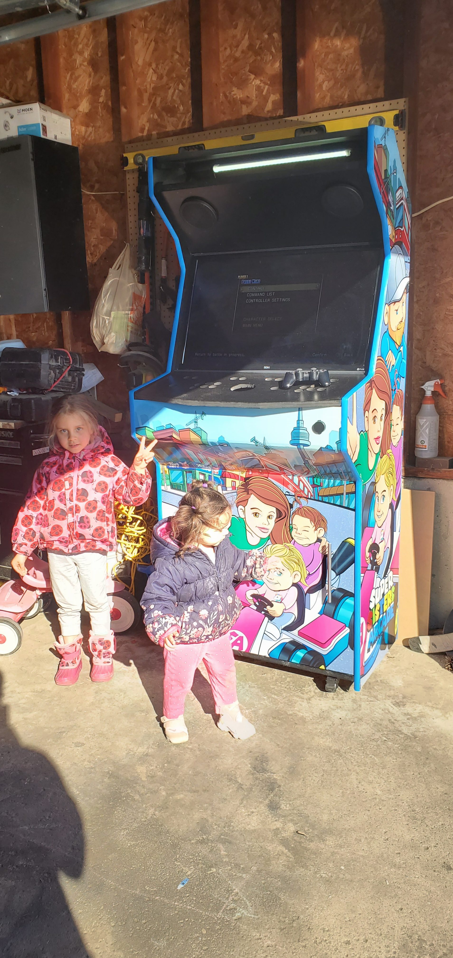
The Super Sisters see the graphics installed for the first time!

20200408_171902


Then I started to work on the buttons. I didn’t have them or the joysticks yet to test fit everything before the control panel install. So I waited to apply these graphics just in case I had to do any modifications to the wooden panel. Luckily everything fit so I was able to quickly install the control panel graphic using the same technique as above.  I chose to go with sanwa sticks with the bat-top and LED buttons to create a colourful cabinet.

20200411_11270520200411_152201-e15868747305982


Testing the trackball out at night prior to hooking up the buttons and joysticks.

20200411_182633


Wiring up the LED’s and joysticks.  Instead of plugging the LED buttons into my computer’s power supply I spliced it and attached it to an old 12v charger. I then hooked it into a bluetooth outlet plug so I could turn off all the lights independently from the rest of the unit. I used a 2-player Xin-mo USB board to hook the controllers to the PC. (Also works for PS3!)

20200412_202616


20200412_204841

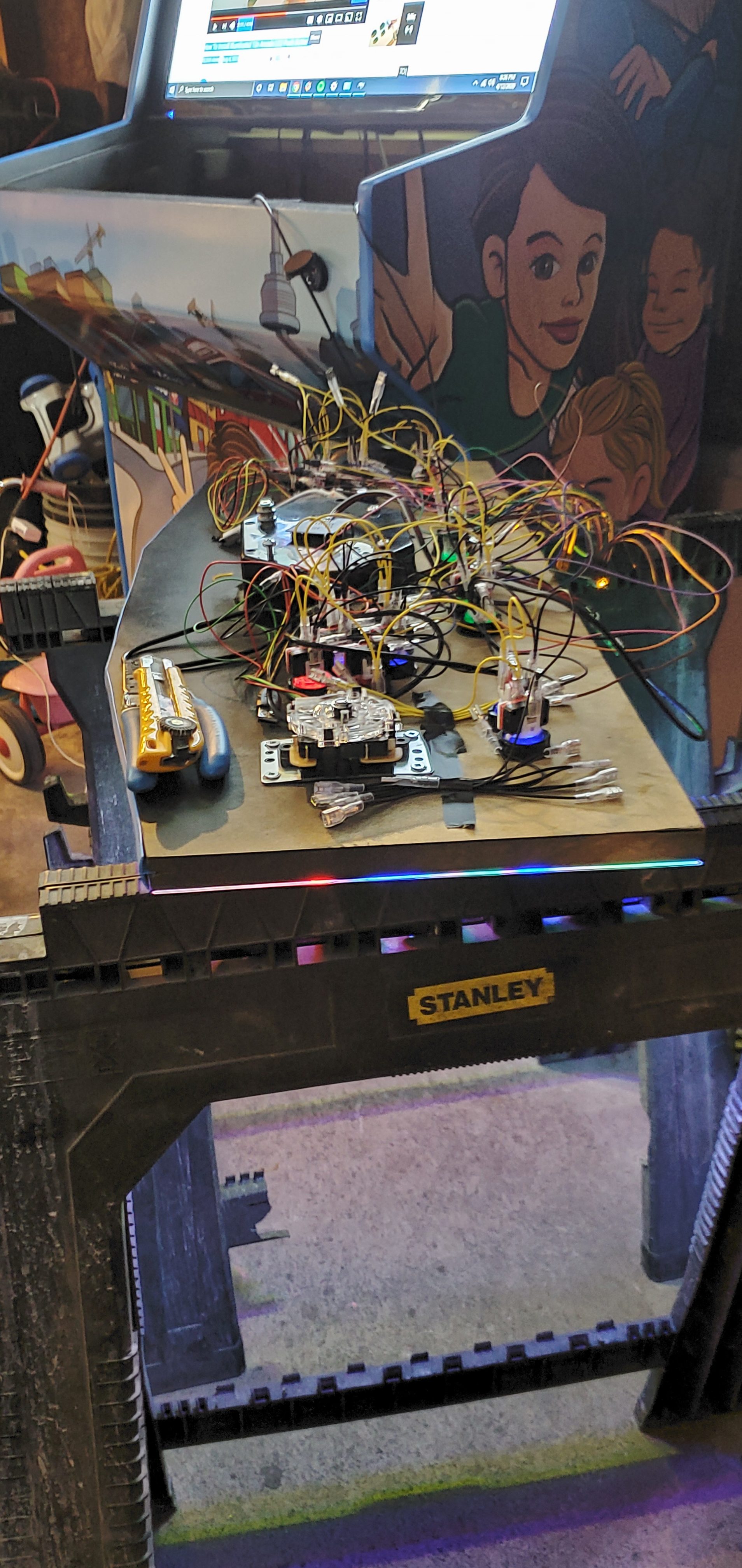
Mapping the Joysticks and buttons

20200411_165411

20200413_1503032


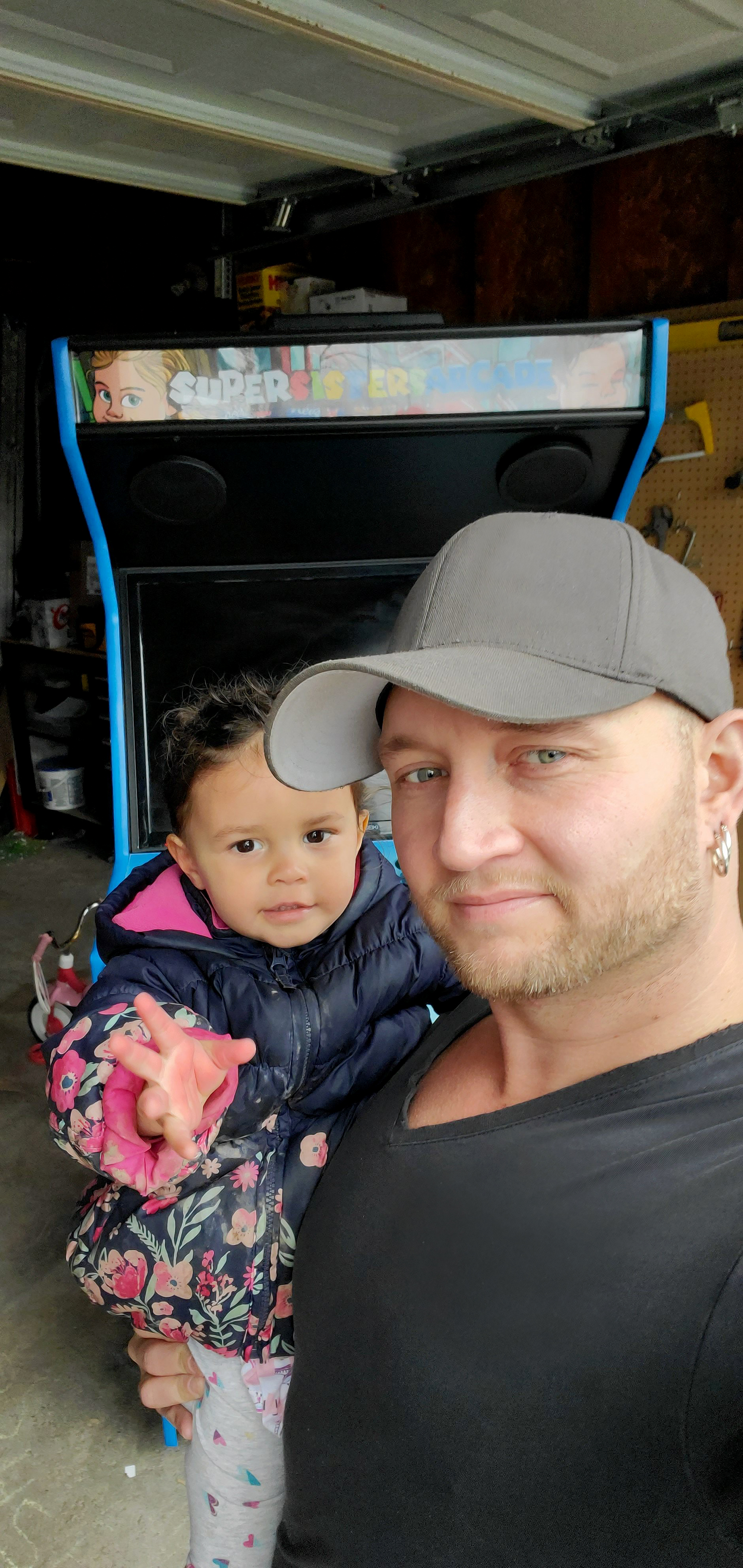
Time to Enjoy it with the Super Sisters.

20200413_143902-e15868764488452

03_FARMHOUSE_WEBSQAURE

Holmes Approved Homes Inspection Stages

Newly added to Portfolio, Illustration/Model demonstrating the different inspection stages of the Holmes Approved Homes Certification Program.

Foundation: This is a detailed inspection of the structure that supports your entire home: the foundation—from the footings to the waterproof membrane system. This inspection protects your home’s resistance against moisture and basement leaks.

Durability: Your home’s exterior building wrap is inspected to ensure maximum mould and moisture protection. Electrical, plumbing and HVAC rough-in stage inspections are also conducted to confirm they have been properly installed.

Energy Efficiency: This inspection tests every part of your home’s construction that has a direct impact on its energy efficiency, including a tight building envelope and sealed air ducts, as well as maximized heating and cooling.

04_FARMHOUSE_ENERGYEFFICIENCY_Websmall

Roof Inspection: A full review of your home’s roof installation is completed, including soffits, trim, gutters and downspouts. This confirms they meet manufacturer warranty conditions to protect your home for generations.

Final Inspection: Your entire home is inspected to make sure it meets every one of Mike’s specifications. This inspection verifies minimum water infiltration, maximum moisture protection and proper ventilation systems for maximized indoor air quality.

Healthy Home: As a final inspection, your home is examined to make sure safer, healthier, more durable materials were properly installed—from paints, appliances and flooring to the HVAC and water purification systems.


07_FARMHOUSE_HEALTHYHOME_websmall

You can find more information on at  www.holmesapprovedhomes.com


SummaryReportIllustrations

Holmes Approved Homes Summary Report Illustrations

Newly added to Portfolio, Created For Holmes Approved Homes 2014.  Technical Illustration.  Illustrations for Holmes Approved Homes Residential Program which offers 3 levels of inspections for new homes built by Holmes Approved Homes builders.  You can find more information on their 3 Tiered system as well as builders who offer the program by visiting their website.  www.holmesapprovedhomes.com

The 3 Stages Holmes Approved Homes offers:

HAH_Durability_C-01

The Holmes Stage Inspection Package.

Proof For Your Peace of Mind.

The HOLMES Stage Inspections Package gives you the peace of mind that comes from knowing your new home is what it should be: Safe, protected and built right the first time. Your home receives (3) full home inspections completed by an Approved Mike Holmes Inspector during key stages of construction, including full photo documentation.

-Holmesapprovedhomes.com


HAH_Roof_C-01

The Holmes Upgrade Package.

A Better Home Built Right.

The HOLMES Upgrade Package not only includes everything in the HOLMES Stage Inspection Package plus an additional stage inspection, it also incorporates supplementary construction features, products and materials that make your home built right for tomorrow. That means healthier living environments, a stronger and more resilient structure, plus increased durability and energy efficiency.

-Holmesapprovedhomes.com


HAH_Efficiency_C-01


The Complete Holmes Package.

The Ultimate Holmes Approved Home.

The Complete HOLMES Package sets a new standard of excellence that takes residential construction to the next level. It features trusted workmanship, the top products on the market and the best building practices in the industry to build a home that is healthy, green, energy-efficient, fire- mould- and moisture-resistant.

-Holmesapprovedhomes.com


More images for this project can be found in my portfolio under, Holmes Approved Homes Summary Report Illustrations


Compilation Oil Rig with Orthographics

Oil Rig Model

Oil Rig Model, 2010.

Created for Sheridan College

Exterior Oil Rig


This Project was created to test some exterior elements using bonzai3D and the rendering capabilities of Strata Cx5 at the time.

It was later compiled together in PhotoshopCS5.


More Images from this project, can be found in the portfolio section.  Portfolio


TheHolmesManual_spread1featured

The Holmes Manual

The Holmes Manual, 2014

Copyright © 2014 Restovate Ltd.  All rights reserved.  Created for The Holmes Group & Harper Collins

I have a couple illustrations featured in Mike’s all-new book, The Holmes Manual.  Due for release June 3rd, 2014.  Please check it out!

TheHolmesManual_front

The Holmes Manual Cover


Maintaining your home now will make your life easier down the road. As Canada’s most trusted contractor, Mike Holmes helps you Make It Right. Providing solutions to everyday problems, The Holmes Manual has your whole house covered: from top to bottom, outside to inside, foundations to finishes. Mike answers the questions homeowners ask him all the time, including: Why do my windows have moisture in them? What is the life expectancy of plumbing? What kind of ceiling is best in a basement? How often should I have my ducts cleaned? How can I tell if our house has mold? Packed with handy tips, photographs, and diagrams, The Holmes Manual is a must-have guide for every homeowner.


More Projects done for The Holmes Group, can be found in the portfolio section.  Portfolio


MIR Homepage Launch

MakeitRight® Responsive Website

Makeitright.ca Responsive website, 2014

Newly added To Portfolio, MakeitRight® Responsive website, Created for The Holmes Group. Web Design

This is a project that I’ve been working on for a fairly long time and one which is still ongoing.  I had the opportunity to completely overhaul the previous version of makeitright.ca.  A website that  was created in the days of the now defunct flash.  It was a daunting task at first glance.  The site is fairly large with many sections – resources, current productions, services, photos, videos, news  a webstore and a non-profit foundation section.  Not to mention trying to retro-fit old tv-show pages to work within the new responsive template.  Working with the communications team here at the Holmes Group, we were able to categories and map out the sections accordingly, a task that took probably just as long as the design process itself.

MIR Webstore

MIR Webstore


The site is fairly large with many sections – resources, current productions, services, photos, videos, news  a webstore and a non-profit foundation section.


The design process started with the Webstore.  A Section which exists independently of the main site Using OS Commerce.  This was a good starting point for the redesign as it allowed us to narrow down the design elements needed for the new site.  Everything started with the Global Navigation menus for both desktop and mobile versions.  Once this was decided we began testing in-house to see how things would work and flow together.

After the webstore was completed which was about 5 months beforehand, we moved onto the homepage and main navigational pages.  (We held off on the webstore launch in the meantime, due to issues regarding member login accounts and the confusion around christmas time.)


MIR Photo Gallery Comp Desktop

MIR Photo Gallery Comp Desktop


One of the more interesting bits in the design process was coming up with the flow of photogallery section.  Photographers like photos to be displayed at their best resolution possible which is not only hard to do for web but even harder to do while creating a responsive website.  I came up with the concept below to try and create that balance between print ready and web friendly quality photos.  The Technical line drawing below was given to a team of developers at trademark5150 to help them better understand the flow of the photo pages. It also helped me to design the page so it would work for this format.  (Form vs Function!)  In MIR photo gallery comp desktop you can see the working stages vs the final stage of both the photogallery index page and the gallery itself.

The way the photo gallery pages worked on the tablet and mobile versions also had to be consider. Here you can see that process.


MIR Photo Gallery Comp Tablet

MIR Photo Gallery Comp Tablet


Photographers like photos to be displayed at their best resolution possible which is not only hard to do for web but even harder to do while creating a responsive website.


MIR Photo Gallery Comp Mobile

MIR Photo Gallery Comp Mobile


More images for this project can be found in my portfolio under, MakeitRight® Responsive Web Design. 

Mike Holmes Official Bobblehead

Mike Holmes Official Bobblehead Packaging

Mike Holmes Official Bobblehead Packaging, 2013

Newly added To Portfolio, Mike Holmes Official Bobblehead Packaging, Created for The Holmes Group. Product Design

Earlier this year I was asked to come up with packaging for a brand new Mike Holmes bobblehead doll/toy.  I was more than happy to have a project like this to work on.  It started with the modeling of mike’s head and body that was done by www.bobbleheadscanada.ca.  (He worked from two reference shots of Mike’s head, both front & side profiles to create a successful likeliness of mike’s face).   Once that was completed I was given the model to take dimensions from and test out packaging ideas.  I knew from the get go that I wanted to have a large visible window to showcase Mike’s bobblehead, so I tested out some designs in photoshop and then printed them out. I took the printed pieces and assembled them together to get an actual view of the box. Once I had a better understanding of that I went ahead and came up with a theme and colour that would suit the project but also the company behind it. The colour theme I chose to go with was a nice middle tone blue that I thought would match the look of the Holmes Group’s current products but still have a little more colour.  The reason for this was because I wanted a more cartoony look as it would better match the fact that it was a bobblehead and not some cold tool.


Mike Holmes Official Bobblehead

Mike Holmes Official Bobblehead


“I tested out some designs in photoshop and then printed them out. I took the printed pieces and assembled them together to get an actual view of the box. Once I had a better understanding of that I went ahead and came up with a theme and colour that would suit the project but also the company behind it”.


I was also tasked to come up with the tattoos that the bobblehead has featured on both arms.  They were created using reference images of Mike’s actual tattoos, dumb down a little bit as I knew there would be scaling issues with the decals.  Creating the tattoos really helped make the bobblehead feel more like the real & “current” Mike Holmes so I’m happy they turned out, better than expected. I used Illustrator to create the tattoos as well as the rest of the packaging.  I highly recommend any illustrators just starting out to try their hand at the slice tool as it works really great in creating cartoony imagery.

Packaging

Packaging

 “Creating the tattoos really helped make the bobblehead feel more like the real & “current” Mike Holmes so I’m happy they turned out, better than expected”.


More images for this project can be found in my portfolio under, Mike Holmes Official Bobblehead Packaging 

Brute War Video Game Cover

Brute War – Video Game Concept Cover

Brute War Cover

Brute War Cover

Brute War – Video Game Concept Cover, 2011

Newly added To Portfolio, Brute War – Video Game Concept Cover, Created for Sheridan College. Product Illustration

This project was created for Sheridan College in 2011 while I was still developing my portfolio.  I was in my final year and was trying to round out my portfolio and I realized I didn’t have any good character Illustrations.  A project came up to create a video game cover and I decided to go with something a little more current and not necessarily technically based.  A project like this was fun but also daunting as I’m not to good with skin painting so I went a little more comic book with the tones.  The character featured in this illustration is based on an image of myself.  I wanted something that made the character look big but also displayed the atmosphere in which the character would exist in.  I chose to go with an “up” angle to achieve that.  Helicopters and buildings were added to fill the sky and create a much grander looking scene. The gun was modelled after the Heckler & Koch MK 23 along with a lot of modification. After some peer review it was noted that the weapon looked a little small in the characters hands.  To fix this problem a large piece was added to the top of the Socom. This created more visual balance in the weight of the weapon compared to the character.


“The gun was modelled after the Heckler & Koch MK 23 along with a lot of modification. After some peer review it was noted that the weapon looked a little small in the characters hands.  To fix this problem a large piece was added to the top of the Socom. This created more visual balance in the weight of the weapon compared to the character”.


Here is a process video showing how the leg armour evolved during the creation of this illustration.  I start off pretty rough and then later fine tune it once i’m happy with it.  I take a different approach with every illustration, sometimes I draw the whole character out and other times I draw parts and then go from there.  Since I wanted to make sure I was happy with the skin – I did that first and then completed the other areas last.

More images for this project can be found in my portfolio under, Brute War – Video Game Concept Cover